Hasselblad Masters 2010 Competition – Semifinalist

Amazing news usually pops up unexpectedly at the busiest time of the year. Recently, I have been notified that my high-speed photo series had made it to the semifinal in the Hasselblad Masters competition. In other words, I am 1 of the 300 talented photographers worldwide who made it to the semifinal. It is very pleasing and honouring to realize my work is being recognized.
http://www.hasselblad.com/Masters/2010/semifinalists/clifton-li.aspx
Screenshot of gallery:

Screenshot of Hasselblad Online Semifinalist Gallery – Clifton Li
My Winning Certificate:

Hasselblad Masters 2010 – Semifinalist – Clifton Li
2010 Applied Arts Student Award Winner

In the recent issue of Applied Arts Magazine (Vol. 25, No. 4, Oct 2010 Issue), I am very joyful to be one of the student winners in the ‘Photography – Single’ catagory. Thank you once again to Ryerson University for providing me with such a wonderful learning environment.
The following is my winning image:

Category: Photography – Single
Title: Water Equations
“A body entering water makes a splash, whose height depends on the mass, speed, and shape of the object. Since about 80% of a fruit’s mass is water, the height of the splash each fruit creates will be related to its size and the amount of water it contains. The waterline in the images creates equality between liquid, solid, and gas; an equal sign that brings the equation of each image together.”

Page 152 – Tear sheet of Applied Art Magazine, Vol. 25, No. 4
November 10, 2010

Exterior of Artscape Wychwood Barns
The exhibit took place at a new venue, Artscape Wychwood Barns, located in the trendy St. Clair & Christie area of Toronto.
“Formerly streetcar repair barns for the TTC, this historic industrial site was transformed into a multifaceted community centre where arts and culture are brought together to foster a strong sense of community.”

2010 Applied Arts Winners Exhibit

My Winning Piece – Water Equations

Clifton Li and his piece

Other Award Winners from Ryerson University – (left to right) Yeounjung Kim, Amanda McNaughton, and Ainsley Boyd.
Designer Hats Spring/Summer 2011 – Behind the Scene
It was a pleasure to be invited as a photographer to take part in a Toronto-based designer hats fashion company for their spring and summer 2011 catalog editorial shoot.
The 2 intense days of shooting were very enjoyable. Location scout was essential in order to plan ahead of time and breeze through the shoot with such a tight timeframe. The weather was very cooperating and food was very delicious! Obviously I am BSing if I say everything went perfect and smooth. One of the Profoto D4 packs failed during the first hour of the shoot, and sadly all the rental places were out of them (probably due to the nice weather). With only one D4 pack left, it was not enough to light 2 different sets simultaneous, so we changed the entire concept and went with natural light.
Here is the behind the scene video:
Model Agencies:
Next Models
Elmer Olsen
Personal Assistant:
Benjamin Killick
Behind the Scene: Keith Richards by Annie Leibovitz
Annie Leibovitz is one of the highest-paid photographers and best known for her stunning portraits that have captured the essence of countless notable figures.
Here is one of her behind-the-scene videos that shows her magic by only using minimal amount of artificial lighting:
The photo is built on the light from the Softlighter and the ambient room lamps. Nothing else. Would you have had the nerve to light a Louis Vuitton shoot of Keith Richards using only a sub-$100 brolly box?
And yes, that light is walking itself around intuitively. The post production will always pull much more out of the photo. She always seems to have a celebrity in front of her lens. And then there is the whole gazillion assistants thing.
But the truth is that Annie Leibovitz creates her own weather. She is great with her subjects. She is great at the bedside manner, the broaching of an idea, the tenacity to stick with it and the $$ to do whatever it takes to make the picture inside of her head.
I love her photos, even if they really are giant collaborations.
![6908-keith-lv[1]](https://cliftonliphotography.com/cliftonliblog/wp-content/uploads/2010/06/6908-keith-lv11-550x317.jpg) (© Louis Vuitton / Annie Leibovitz. Click the pic for bigger version.)
(© Louis Vuitton / Annie Leibovitz. Click the pic for bigger version.)
Paris Li Fall/Winter 2010 Collection – Behind the Scene
Paris Li, www.parisli.net
“One of the newest resident members at the Toronto Fashion Incubator, Paris Li is the founder and designer of PARIS LI, a contemporary women’s wear line inspired by the Asian philosophy of beauty and elegance.”
So therefore, the shoot took place at Toronto Fashion Incubator. It is an innovative and highly respected non-profit organization dedicated to supporting and nurturing small business entrepreneurs. More info can be found here.
This goal of this shoot is to create a lookbook for Paris’ winter 2010 collection. This shoot was done back in Jan 2010. This extremely long delay is not because I am slow at working, the truth is because some of the clothes are participating in a national competition.
The setup of the shoot is quite simple, since it only involves a blown out background. Although it might be simple in a studio setting, I encountered some problems during the shoot. The walls perpendicular to the backdrop is not exactly black, so flare or colored spilled can ruin the day.
Here is the behind the scene video:
Stylist Assistants:
John Medalla
Flora Ghent
Make-up Artist:
Sherlyn Torres
Model:
Blythe Cronyn
Lastly, thank you to my personal assistants:
Helen Wong
Marcus Chan
Lighting a Glass Bottle – Behind the Scene by Derek Cooper
Derek Cooper is a professional still life and food photographer based in Toronto.
http://portfolio.derekcooper.com
I’ve been working on a lot of shoots with glass lately. Glass is particularly difficult to shoot, especially curved glass surfaces like that of a bottle. It acts as a mirror, seeing everything around it, so it becomes an exercise in controlling light in every detail.
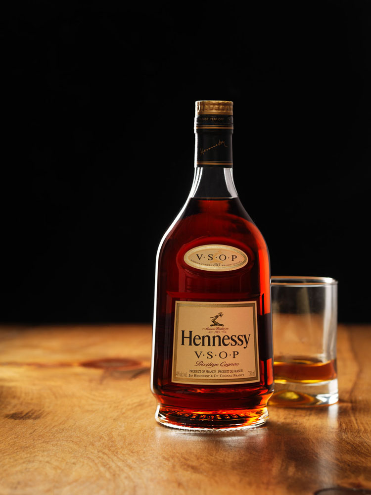
Here’s a behind-the-scenes look at how I shot this bottle of Hennessy Cognac with a glass. This diagram shows an overhead view of the lighting setup – the Hennessy bottle is the circle with the star on it.

I used two light sources mounted behind a very large sheet of white plexi, sand-blasted on the side facing the set. The bottle of Hennessy was sitting on a large piece of oak. I wanted to completely back-light the bottle so the liquid would tend to glow and I wouldn’t show any reflections on the front of the bottle. I knew I was going to use a series of shots to create the final composited image.
The black gobos are used to cut the light coming from the large sheet of plexi – that allowed me to control exactly where the light was going to fall. The gobo behind the set in the frame of the shot was a section of black velvet – it’s still the best at absorbing light.
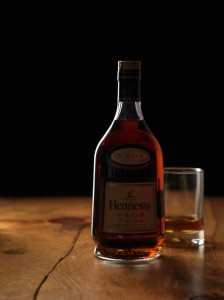 So, here’s the first shot of the set – for the bottle details, the glass behind it, and the lighting along the left edge of the bottle.
The gobos make sure the thin strip of light down the left side of the bottle doesn’t migrate too far forward. If the left gobo were removed, you’d get a large, wide white strip down the left side of the bottle – resulting from the reflection of the white plexi behind the set.
The gobo to the right of the bottle cuts any light that may be reflecting around the room. Since it’s glass, it’ll see any light in the room that is strong enough. The gobo kills any of that ambient light.
Finally, the gobo beside the camera is cutting the light from hitting the lens. It is blocking the light from the plexi sheet coming from the strobe to the left, and it is also cutting the light from the strobe behind the plexi to the right. If that gobo were not there, I’d get lens flare.
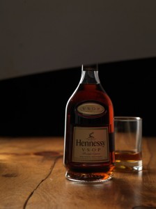
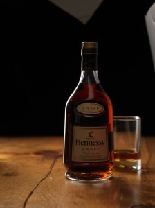 Next step is to light the labels.
That is done in two separate shots – one to light the main labels on the front of the bottle, and a second shot to light the cap.
To do that, I used a sheet of silver florentine and bounced the light back onto the front of the label. Silver florentine is just like a shiny piece of thin cardboard – great for reflecting light.
You have to be patient with positioning the card – you want the light to bounce from above and down, so you don’t get shiny reflections on the label. You also want to make sure the light is bouncing along the labels in the same location, otherwise it would look like the labels were each shot separately.
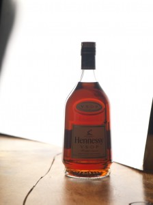 In the last shot, I placed a large sheet of silver florentine behind the bottle and positioned it so it would reflect the light from the white plexi toward the camera.
This shot will be used to illuminate the liquid in the final composite.
It’s important to fill the entire width of the bottle with light so all the liquid is lit up, being careful not to leave black gaps along either side of the bottle.
It’s also important to make sure the silver florentine card isn’t moved too far forward on the right side of the bottle, otherwise it will reflect on the front of the bottle and ruin the overall shot.
Remember not to adjust any of the settings on the camera – you don’t want to alter the aperture, otherwise it will make compositing the shots later virtually impossible. Keep everything the same from shot to shot, and be careful not to move the bottle.
Once all the pieces are shot and ready, you then composite them together to create one final shot. Here is the result.
Kevin Cooley – Master at Night Photography
Kevin Cooley lives and works in Brooklyn, New York with his wife and is primarily a photo and video artist who does freelance assignment work as well. He is well known for his night photography. His extended use of ambient light combines with the magic hour is unbelievable.
He surprised me with creative ways of using/exploiting light in the video below. To great end, too.
Kevin Cooley is represented by Redux Pictures:
“Redux Pictures is an independent commercial and editorial photo agency based in New York City with photographers located around the world. We opened our doors in 2003 and quickly emerged as an industry leader, receiving many major awards, including World Press, Overseas Press Club, American Photography and Communication Arts. Redux takes pride in being a strong advocate for the power of modern photography and the creative individual to affect change.”
You can also check out the agency’s blog if you have time. Definitely spend some time on it, since there are great inspirations and ideas from their most current assignments. Also more promotional videos are available on their Vimeo Site.
Distility Photoshoot – Behind the Scene
It was a honour to have the opportunity to photograph the founder and PR director of Distility Branding.
The shoot was extremely successful and went according to the schedule. I basically used 2 Profoto heads and a reflector for the photos. The secret behind the school is to balance the background ambient lights with the strobes. The cloudy day also helped by creating a very even lighting on the interior of the MaRS building.
Here is the Behind the Scene of the day:
CEO: Axle Davids
PR Director: Andrew F Stewart
Distility Branding, www.distility.com
“Formerly known as aXle Branding, Distility Branding is a Toronto-based brand identity, naming and design company with a twist.”, quote from website.
What is so special about this branding company? Axle had spent more than eight years researching and developing a system called 1Day1Brand. It is basically a one-day workflow with no prep work or homework. It was designed to meet the needs for small and medium-sized enterprises. The result of this workshop is the rudimentary foundation of the brand; its promise, pillars, positioning and personality.
Special thanks to my personal assistants:
Helen Wong
Jonathan Hutchinson
Terry Richardson – Lacoste 2009 – Behind the Scene
“Terry Richardson is an international celebrity as well as one of the most prolific and compelling photographers of his generation. Known for his uncanny ability to cut to the raw essence of whomever appears before his lens, Mr. Richardson’s vision is at once humorous, tragic, often beautiful, and always provocative.”, from his site.
I basically found these two behind-the-scenes very interesting. The combinations of fans, motions, and water droplets created quite amazing results. Although, I am wondering how he prevented the models from being electrocuted. =)
PS. I love the colors and sketches of the drafts.
Lacoste – Spring/Summer 2009
Lacoste – Fall/Winter 2009
http://www.terryrichardson.com/
Behind the Scene with Dean Collins
Dean Collins is a grand master at photography. Although most of his work are shot by 4×5 or 8×10 negatives (Ancient History), the techniques are all still very usable nowadays. There is no better way than to learn from his educational DVD set. He shows you example after example of how seemingly impossible lighting challenges can be broken down into a series of small, solvable problems.
In the two examples shown in this post (Thank you to Software Cinema for posting one of the twenty shoots on the ‘best of’ DVDs to YouTube in its entirety).
First is a 20 minutes long video that shows how Collins lit a motocycle perfectly. He handles problems such as creating the illusion of speed where none exists, getting highlights on the dull, black tires and creating absolutely perfect specular highlights before Photoshop.
Part 1:
Part 2:
The second example is quick 5-mins-shoot with the CEO and CFO of an airline. He placed “look-a-like” to set up the scenario and lit the scene with spectacular backlight. He tackles problems such as controlling light spill, creating long sunset shadows with only an orange gel, and balancing background light vs subject light.
And, IMO, the best things about these types of shoots is not that they teach you how to solve a specific set of problems. It is that they make you realize that you can learn to light anything.
Part 1:
Part 2:
The entire DVD set filled with tutorials can be purchased here:
The Best of Dean Collins on Lighting

