Photoflex 7′ OctoDome Photoshoot Demostration
Anyone who works with a camera will tell you that setting up and capturing an image is a form of communication. A single picture or still frame, when done correctly, has the ability to tell a story. As a result, lighting becomes a crucial aspect of this storytelling. It sets the tone of an image and in advertising, the story or tone told by an image is everything.
The other day, I had the privilege of helping out a friend who owns a games facility used for team building exercises. They were looking for some promotional images that really communicated the energy of the space and showed the wide range of the activities they had to offer in a way that caught the eye and captured the imagination. I needed a light modifier that was able to help me better tell a story and that would contribute to executing the wide range of moods that I wanted to convey.
7′ OctoDome
The 7 foot OctoDome from Photoflex was the perfect modifier needed to achieve the different atmospheres and moods I wanted for this shoot. Photoflex is a company dedicated to providing the highest quality lighting equipment. It’s accessories and set-ups are top of the line, and they offer state-of-the-art technologies that help photographers capture that perfect image. With it’s unique, 8-sided shape and narrow profile, the OctoDome is one such technology as it’s designed to be the perfect key light and bathes facial features in bright, soft light. It’s internal baffle eliminates hot spots and it’s designed to give big box light spread in a space-saving soft box. It’s particularly effective when being used with the HalfDome and LightPanel, which were the other pieces of modifying equipment I brought with me for the shoot.

It’s easy for a single person to assemble and easy to set up. It’s dependable and versatile for creating the perfect image under different circumstances and in different environments to relay the exact mood and tone that I’m searching for. The OctoDome excelled at helping me communicate exactly what I wanted to say through the medium of my lens.
The First Setup
The First Setup
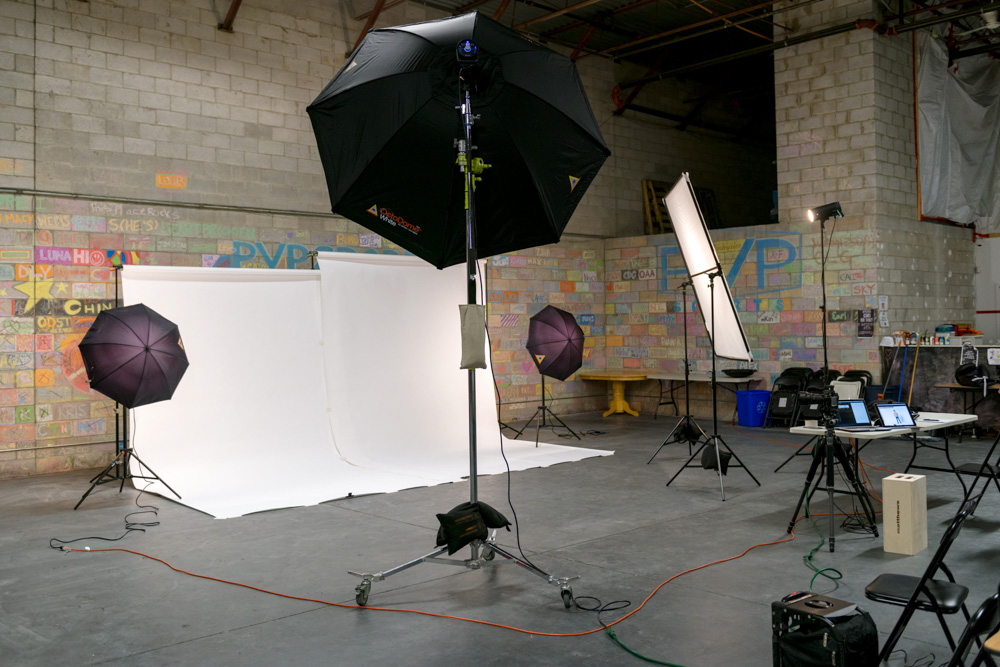
The first of the three set-ups was a white backdrop set up that’s often used for corporate or web-based photos. I used the OctoDome as a frontal key light to create a beautiful, even spread of light that was crucial to a clean bright background. In addition to the OctoDome, I used two Photoflex umbrellas to even out the white tone of the background.
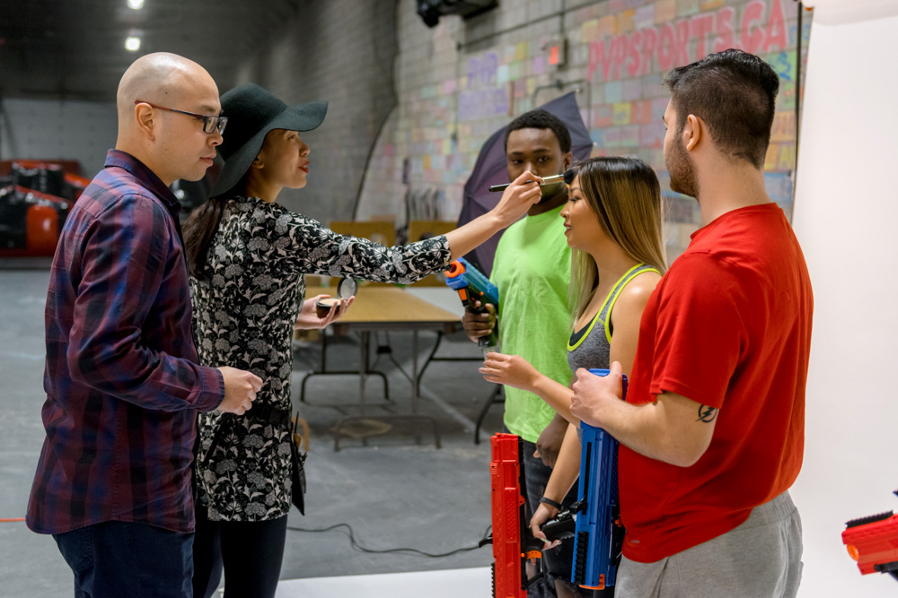
Maggie Ng putting make-up on the models.
To capture the nature of the activities, I put the models in a colourful wardrobe that popped cleanly against the white background and helped show the energy and movement associated with the sports. The LitePanel was used in conjunction with the OctoDome to fill in the shadows and even out the image.
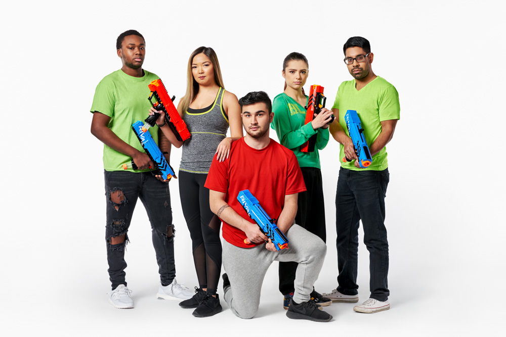
©2017 Clifton Li Photography
The Second Setup
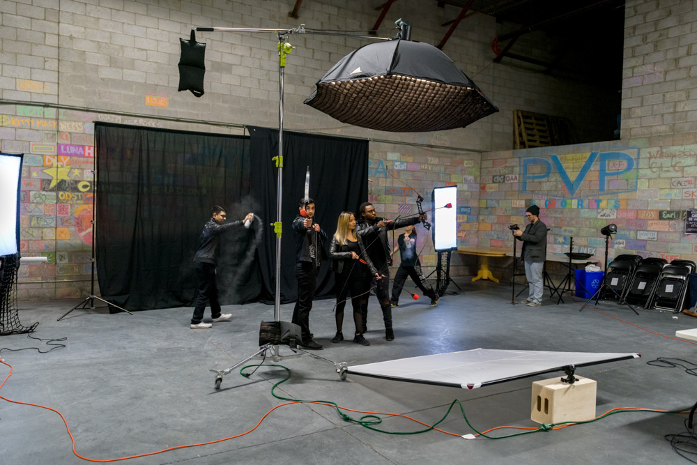
The Second Setup
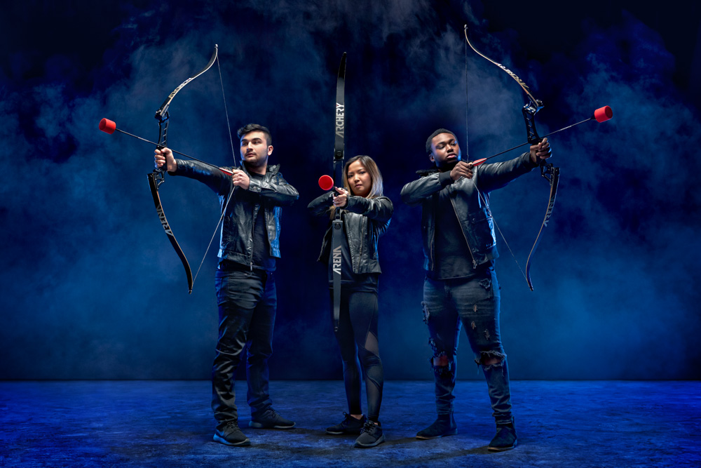
The second set-up set a much moodier and mysterious tone reminiscent of something out of a gritty action film. We changed the OctoDome from a frontal key light to a top light with the addition of a grid to create a harsher shadow. The black background, in combination with the addition of coloured gel added to the medium half-dome at the sides of the back light and the added haze, contributed to the more ‘dangerous’ vibe that would peak the viewers’ interest. I had originally attempted to add a grid to the half dome as well, however I found that the haze didn’t catch enough light due to a limited spread.
But it didn’t work as expected due to lack of light spread, the haze didn’t catch enough light, so I took them off. Sometimes it pays to step back and keep in mind the KISS method – Keep It Simple Stupid! The simpler set-up in this instance proved to be what we needed to give off that post-apocalyptical vibe I was searching for.
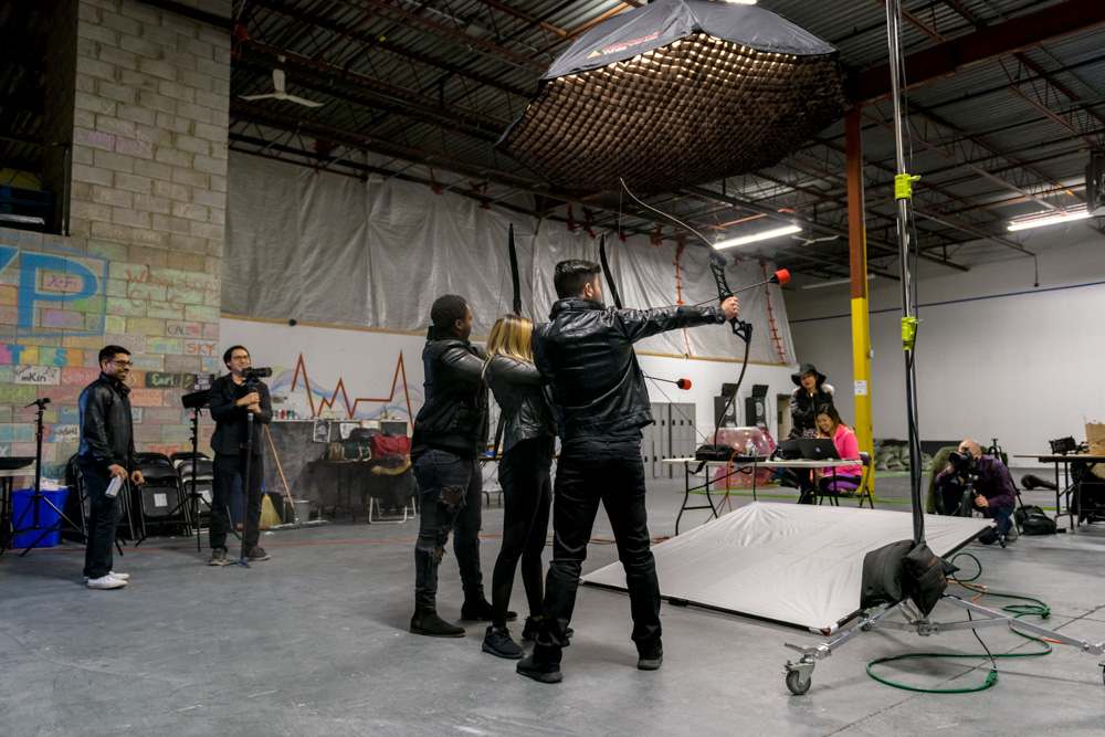
Another Perspective of the Second Setup
Models dressed in edgy black leather and with serious emotional expressions (I had told them to think of the hit book/movie series “The Hunger Games” while composing their facial expressions for this shot) completed the look, reflecting the blue edge light and popping their faces in the final image for a crisper look.
©2017 Clifton Li Photography
The Final Setup
The Third Setup
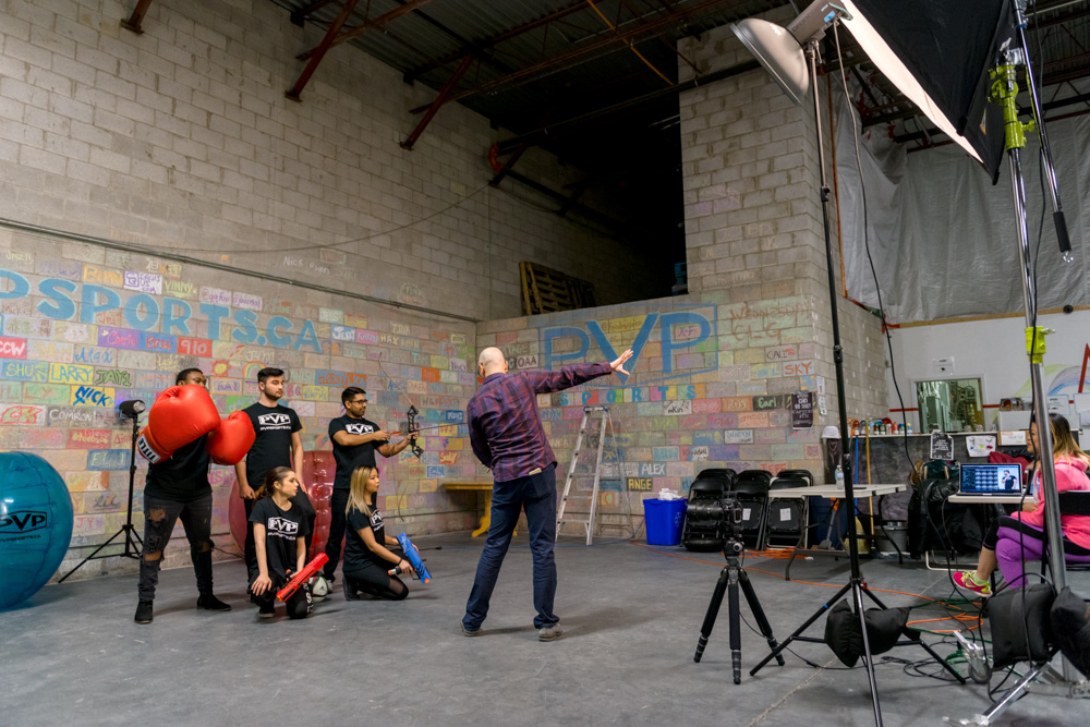
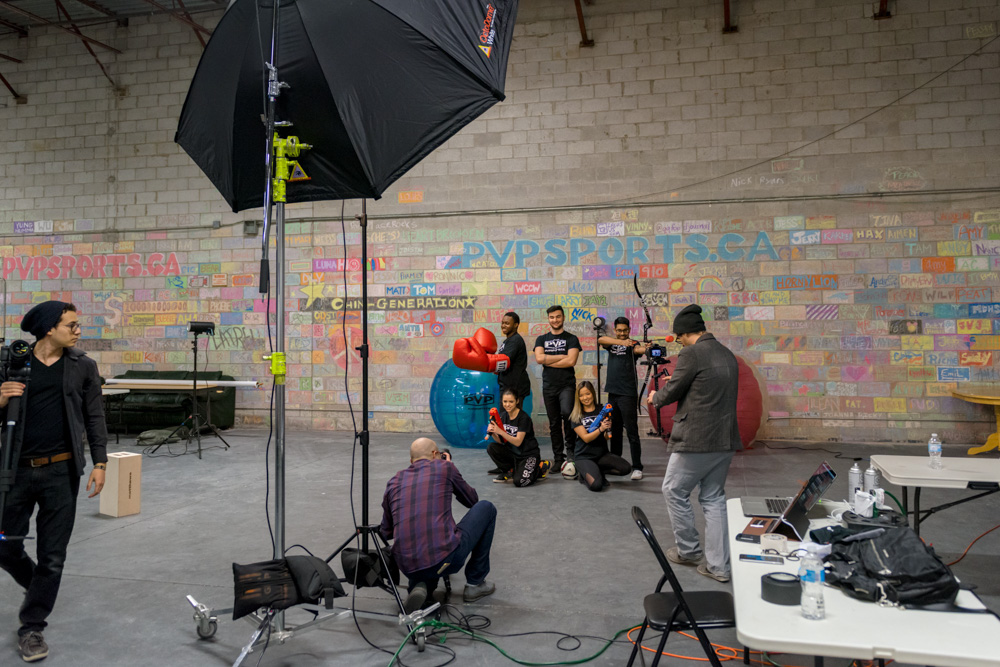
The final set-up, thanks to the good background and location, was the simplest to achieve. The beauty dish helped better define the background bricks and really accentuated the features of the
models, and the OctoDome helped fill in the shadows and lessen the contrast. Using a bare bulb backlight cut out the models from the background, adding depth to the image and making each model stand out.
Another Perspective of the Final Setup
The back light is the brightest part of the photo, and combined with the added shadow on the floor creating a natural vignette, the viewer’s eye is very effectively drawn to the middle of the shot, where the PVP logo is front-and center, surrounded by all the available activities at the facility – crucial to any high quality promo image. It was a fun, clean, even wholesome look that conveyed “fun” and “teamwork”.

©2017 Clifton Li Photography
In the end, both the client and I were thrilled with the images, none of which would have been fully realized without the help of the OctoDome, or any of the other Photoflex products that I used. The high standards they set for their products was totally evident, and their ease of use and the stunning final images have cemented their permanent place in my arsenal. I highly recommend that any photographer serious about their craft head over to their website and check out what they have to offer.
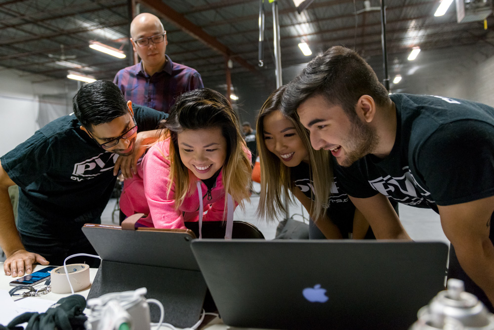
Clients and models reviewing the images.
I know that my upcoming projects, like this one will be all the more spectacular with Photoflex at my back.
Credits
Make-Up Artist: Maggie Ng
Assistant: Brian So
Lighting a Bottle (Part 3/3)
Transparency and Reflectance
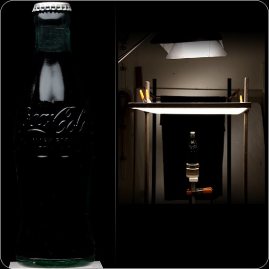
These factors depend exclusively on the lighting technique, as will be shown by the following examples.
1. Top light: here light acts only upon the top of the subject and outlines the high-relief shape.
(more…)
Bottle Pre-Production (Part 2/3)
Below, you will find a step-by-step guide on how to perform the pre-production of a bottle for a still shot.
1. The paper labels are never properly or symmetrically bonded in bottles. For their removal, let the bottle soaked in water for a couple of hours; that’s what makes the label come off the bottle. Thus, the glue dissolves and the paper comes off without much effort.

2. In the case of plastic labels, it’s unnecessary to soak (more…)
Preparing Your Still Life Studio (Part 1/3)
Lecture originally presented at the Estúdio Brasil 2010 photo conference, São Paulo.
The word “still”, as it is used in Photography, comes from a reduction of “still life”. To most, shooting stills is a very tedious practice with little appeal. But if you’re interested in learning several lighting techniques, from basic to sophisticated, the best option is to start shooting products. From a little diamond ring to huge settings, light is key. Only then comes the aesthetical sensibility and the photographer’s style. Of all fields within Photography, the most diverse and productive is Still Photography. New products are released daily; new cosmetics, new recipes, new drinks, new food, juices, water, clothes etc. The dynamics of the market forces clients to renew their products visuals and packages (more…)
Lighting a Glass Bottle – Behind the Scene by Derek Cooper
Derek Cooper is a professional still life and food photographer based in Toronto.
http://portfolio.derekcooper.com
I’ve been working on a lot of shoots with glass lately. Glass is particularly difficult to shoot, especially curved glass surfaces like that of a bottle. It acts as a mirror, seeing everything around it, so it becomes an exercise in controlling light in every detail.
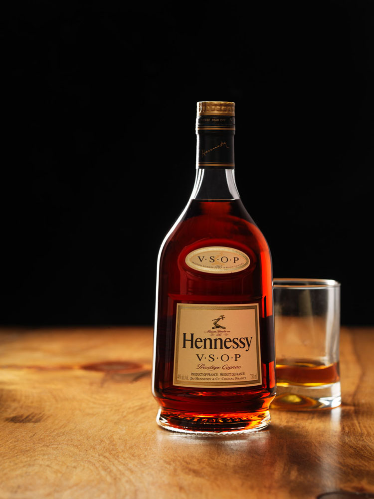
Here’s a behind-the-scenes look at how I shot this bottle of Hennessy Cognac with a glass. This diagram shows an overhead view of the lighting setup – the Hennessy bottle is the circle with the star on it.

I used two light sources mounted behind a very large sheet of white plexi, sand-blasted on the side facing the set. The bottle of Hennessy was sitting on a large piece of oak. I wanted to completely back-light the bottle so the liquid would tend to glow and I wouldn’t show any reflections on the front of the bottle. I knew I was going to use a series of shots to create the final composited image.
The black gobos are used to cut the light coming from the large sheet of plexi – that allowed me to control exactly where the light was going to fall. The gobo behind the set in the frame of the shot was a section of black velvet – it’s still the best at absorbing light.
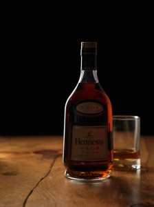 So, here’s the first shot of the set – for the bottle details, the glass behind it, and the lighting along the left edge of the bottle.
The gobos make sure the thin strip of light down the left side of the bottle doesn’t migrate too far forward. If the left gobo were removed, you’d get a large, wide white strip down the left side of the bottle – resulting from the reflection of the white plexi behind the set.
The gobo to the right of the bottle cuts any light that may be reflecting around the room. Since it’s glass, it’ll see any light in the room that is strong enough. The gobo kills any of that ambient light.
Finally, the gobo beside the camera is cutting the light from hitting the lens. It is blocking the light from the plexi sheet coming from the strobe to the left, and it is also cutting the light from the strobe behind the plexi to the right. If that gobo were not there, I’d get lens flare.
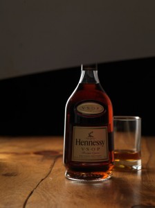
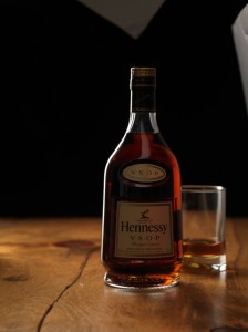 Next step is to light the labels.
That is done in two separate shots – one to light the main labels on the front of the bottle, and a second shot to light the cap.
To do that, I used a sheet of silver florentine and bounced the light back onto the front of the label. Silver florentine is just like a shiny piece of thin cardboard – great for reflecting light.
You have to be patient with positioning the card – you want the light to bounce from above and down, so you don’t get shiny reflections on the label. You also want to make sure the light is bouncing along the labels in the same location, otherwise it would look like the labels were each shot separately.
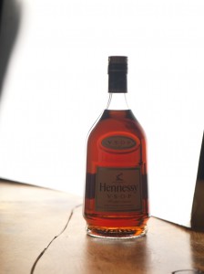 In the last shot, I placed a large sheet of silver florentine behind the bottle and positioned it so it would reflect the light from the white plexi toward the camera.
This shot will be used to illuminate the liquid in the final composite.
It’s important to fill the entire width of the bottle with light so all the liquid is lit up, being careful not to leave black gaps along either side of the bottle.
It’s also important to make sure the silver florentine card isn’t moved too far forward on the right side of the bottle, otherwise it will reflect on the front of the bottle and ruin the overall shot.
Remember not to adjust any of the settings on the camera – you don’t want to alter the aperture, otherwise it will make compositing the shots later virtually impossible. Keep everything the same from shot to shot, and be careful not to move the bottle.
Once all the pieces are shot and ready, you then composite them together to create one final shot. Here is the result.
