CIL Paint Ad – Penny Project with DDB Canada
Recently, I have been working on some incredible projects. I got this amazing opportunity to work with David Ross and Dean Hamann from DDB Canada to cooperate on an advertisement project for CIL Paint.
The print ad is meant to be a continuation of the TV commercial that was a huge success last year.
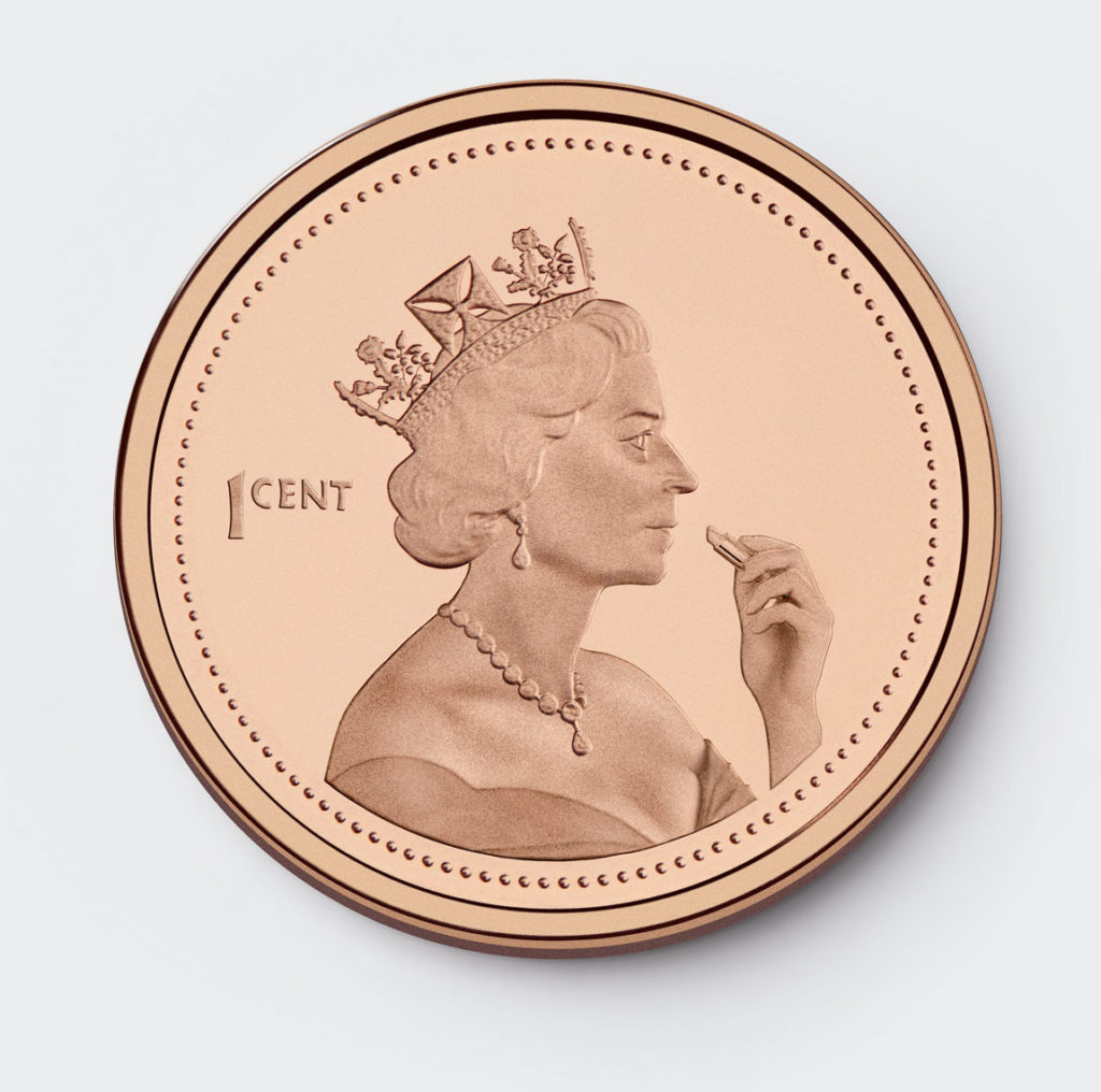
The ad concept was to photographically and digitally construct a penny where the Queen was putting on lipstick to show the affordability yet great quality of CIL paints – “Beauty on a small budget”.
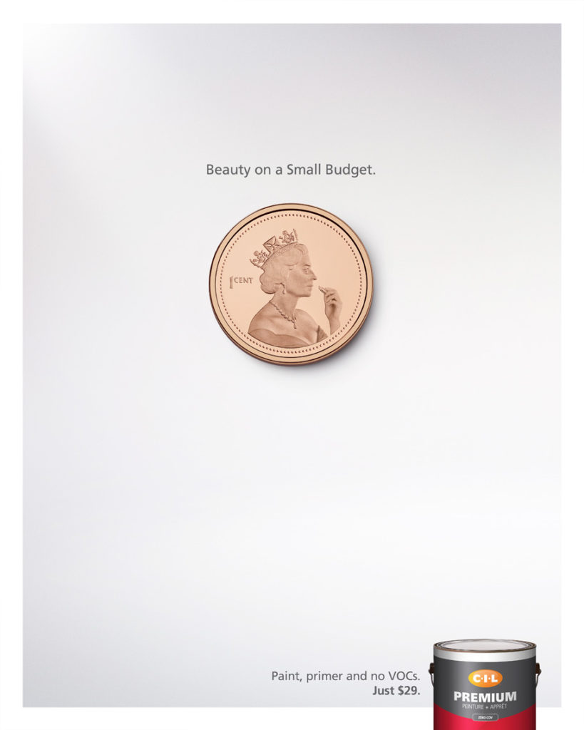
Final Ad Layout
I was so enthusiastic about the idea when it was presented to me that I started organizing the photoshoot the same night. Since Canadian pennies are no longer being circulated, it wasn’t easy to find a penny, especially not one that was perfect without any scratches. So I simply bought a collector’s penny that was in mint condition for ten dollars. It was definitely worth it, particularly if it meant that it would save editing time in post-production.
But searching for the coin was not the difficult part, it was imagining the Queen’s attire when she took the photo for the penny. I re-imagined the Queen with some added humor by hiring a curvier model to emphasize the sexiness of the act of applying lipstick.
©2016 Clifton Li
For the photoshoot, I used a large Photoflex strobe softbox to give me consistent lighting and to match the lighting of the penny. Photoflex creates softboxes that have quick-release corners making them easy to set-up and tear-down. Their softboxes are made with a DuraCloth fabric that ensures colour neutrality, softened light, and prevents light leaks. The Queen’s image on the penny was softly and evenly lit, which will also make the retouching job a lot easier. The shadows were painstakingly matched to make the ‘Queen’ appear as realistic as possible.
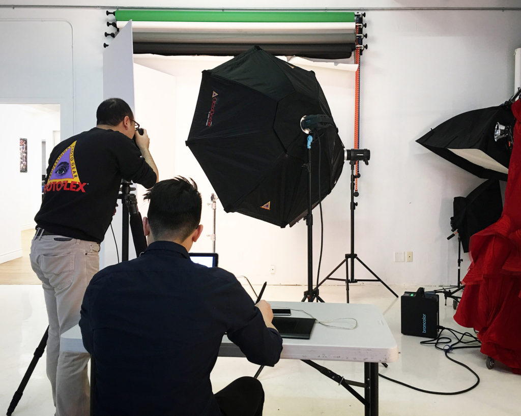
The setup at the studio
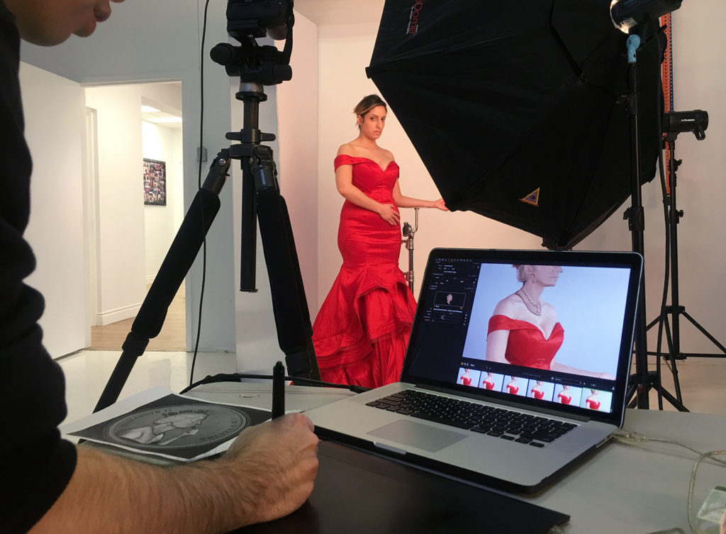
Dress and the model
Thank you to David for providing with me this wonderful and fun opportunity and to Photoflex for sponsoring the photoshoot.
Creative Project with Palettera and Ferris Wheel Press
In this blog post, I will be sharing with you my photographic process, from the drawing board to the finished product.
Deborah and Ray, the creative minds behind Palettera Custom Correspondences and good friends of mine, wanted to cooperate on a project that put all of our best talents forward. Palettera has become one of the best custom stationery design companies in the wedding industry and with good reasons. They are a Canadian company that promotes hand-craftsmanship, quality, and originality. They produce beautiful and unique wedding stationery designs in order to make each wedding feel one-of-a-kind. In light of their success, Deborah and Ray started a sister company called Ferris Wheel Press in recent years, which is operated by Ray’s brother, Jimmy.
Concept and Brainstorming
First and foremost, I started with planning out a concept. Since I was so fascinated by the immense quality of the designs, I decided I wanted to depict the illustrations coming to life. I began with meticulously going through their online portfolios to see if there were any pre-existing designs that would be most suitable for this concept. I came upon a card from the Goldfish series and felt it was the perfect candidate for this concept. I then drew a rough draft of my idea and afterwards I started scouting for my future team members.
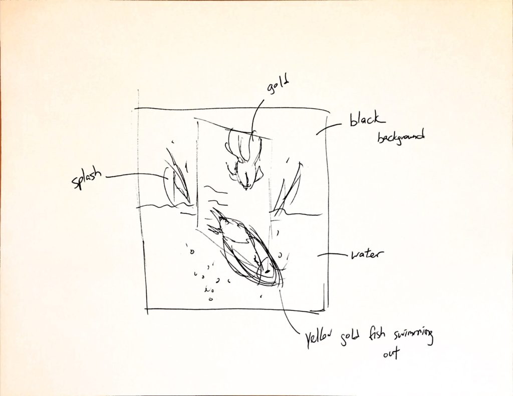
The sketch used to present my Idea to the team.
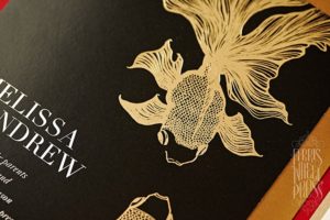
The design that inspired my idea.
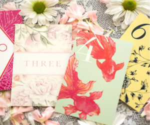
The position of the fish that I want to recreate in black and gold.
Building the Team
Building the team is one of the most important steps because these are the people that will be helping to make the concept become a reality. I worked with the people from Palettera and Ferris Wheel Press in order to obtain the cards that I needed to shoot. They were very nice and created for me a black card with gold illustration to precisely match my concept. From the Plutino Group, I invited Jeanie Lee to be the prop stylist for the project. Jeanie was in charge of sourcing the live goldfish for the photoshoot and for creating the water splashes that would be included in the final shot.
Last but not least, Photoflex provided the light modifiers that helped to give the photoshoot that magic touch and helped to bring everything to life, particularly the goldfish.
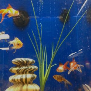
Goldfish options from Jeanie.
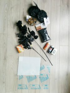
Prop ideas.
Shooting the Card
Prior to photographing the goldfish and the water splashes, the card had to be shot. This was done in advance so that I could have time to edit the image in Photoshop. I removed the text that was originally on the card and the placement of the fish had to be altered slightly. The position of the goldfish had to be exact so that the editing of the real goldfish could be seamlessly done so afterwards. I modified the placement of the fish by combining a few images together, however, I had to ensure that the reflection of the light hitting the gold letterpress was consistent throughout the images – this was difficult.
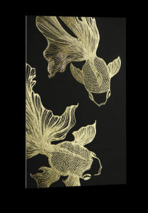
Custom created card.
Shooting the Fish and Splashes
Once we had the image of the card, then we knew exactly how we needed to position the real goldfish in the photoshoot. This step was the most challenging since they are real fish, they are unpredictable, uncontrollable, and most of all, harm-able – and we didn’t want to harm them. We gently played with them for two hours and after an entire two hours, we only had one usable frame! It’s important to say that no goldfish were mistreated during the photoshoot or play.
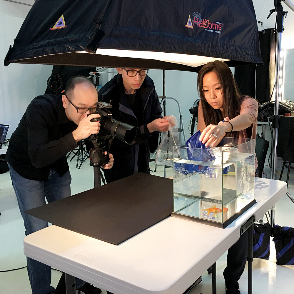
We were working hard to push the goldfish to move the way we want.
The next piece of the puzzle was to get a good image of the water splashing, the bubbles, and the waves. We kept playing with the water until we captured the perfect shot. We used the Broncolor Scoro in combination with the Photoflex Softbox in order to freeze the movements of the goldfish and the water. This combination gave a brilliant and even light to the scene. While the strobes were quite far away, the Scoro had a 3200-watt power, which gave me just enough light for the depth of field I needed.
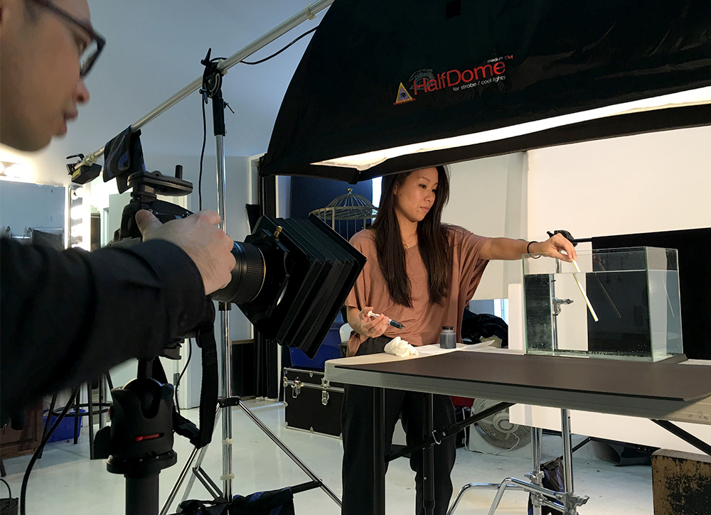
About to create bubbles.
Post-Processing
Finally, the post-production work! It was really fun to pick from a variety of splash and bubble images to see which one would work best with the composite image. I photographed all the images against a black background since I knew the final image would have a black background as well. This strategy also helped to save a significant amount of time cropping the bubbles out from the background.
I am incredibly satisfied with the end result and so impressed with everyone’s hard work and contribution. Thanks to Jeanie’s expert skill in handling the fish and creating the water splashes. The photoshoot was much shorter than we all predicted. This project was a great addition to my portfolio since I had no animal-related shoots prior to this and it demonstrated my ability to create the perfect composite image.
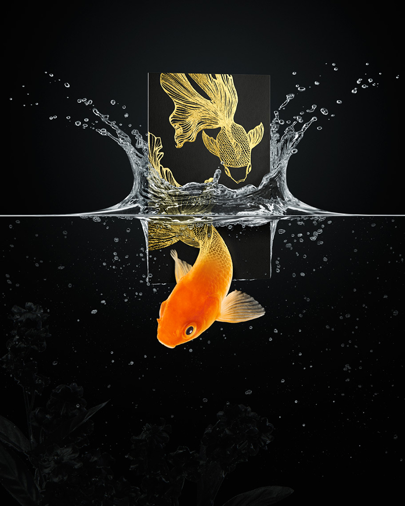
The final composition!
Social Media Campaign with Baroque BBQ and DDB Canada
Summertime is here and that means it’s ribs and barbecue season. Barque BBQ on Roncesvalles Avenue here in Toronto has one of the city’s best smokehouse meats.
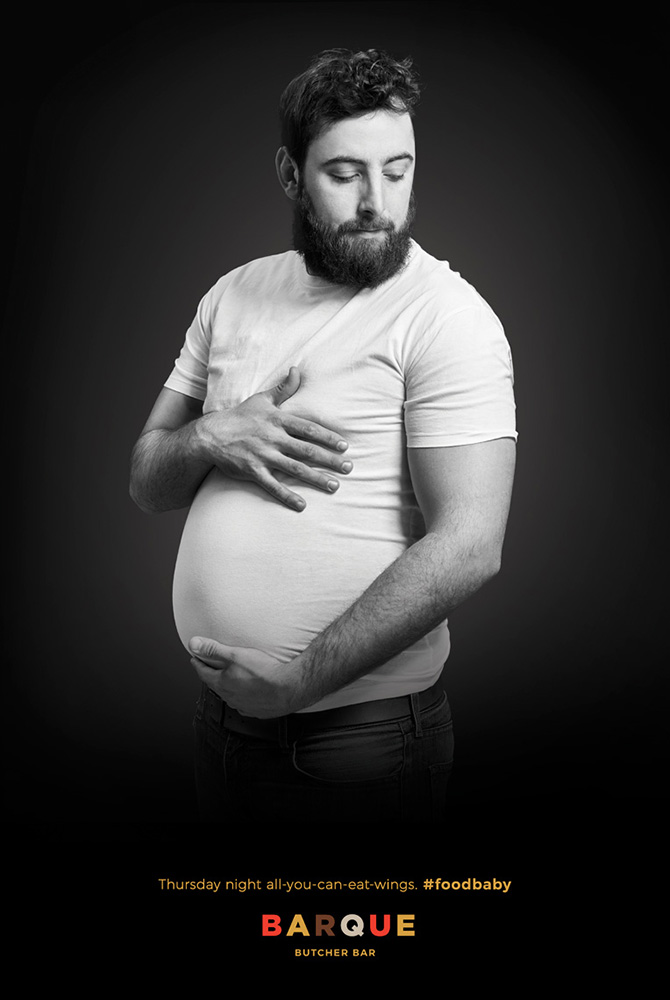
Kyle Waye, who is a junior copywriter at DDB Canada recently contacted me to work on a social media campaign for Barque BBQ. It was the perfect way to prepare myself for the summer season and they had a hilarious concept, so of course I said yes!
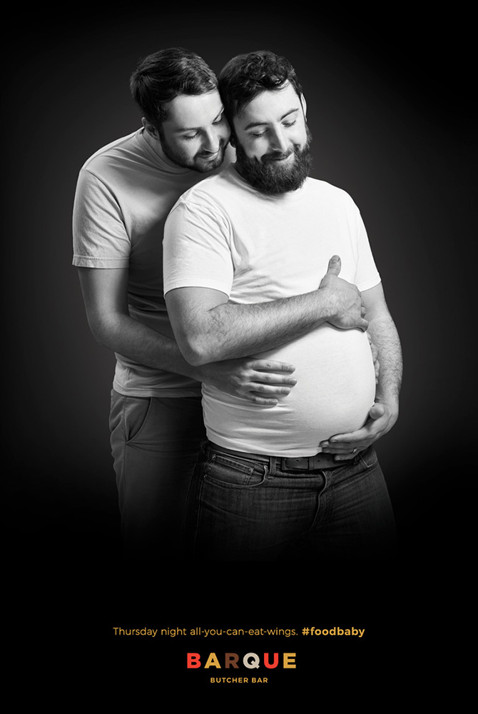
The campaign was to promote all-you-can-eat wings on Thursday nights but I feel it’s much more far-reaching than that. It’s an amazing ad in general. Barque and DDB Canada wanted to replicate classic maternity photographs to show off the ‘food baby’ after an all-you-can-eat wings night. We hired a fabulous talent who was very proud of his wonderfully round belly and played the part excellently. A second talent was also brought onto to the shoot to embrace the expecting dad to further exaggerate the feeling of a family portrait. I decided to use a lighting style that would best reflect typical family portraiture, simple, soft, and even.
Kyle making his select with Mood board.
Although the shoot was only three hours long, Barque was kind enough to provide catering for the whole crew. The social media campaign is published on Instagram and various other platforms.
Food sponsored by Baroque BBQ.
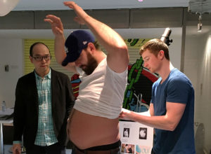
Kyle is doing his magic with the talent.
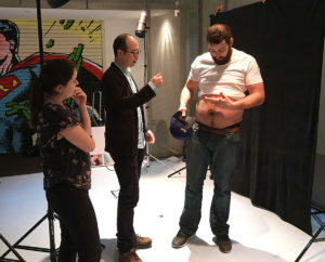
Thank you to Kyle and Barque BBQ for this opportunity and I’d like to confirm that the food is incredible and is definitely worth having a food baby for.

Joanna Makomaski for Risk and Insurance Magazine

Cover of Risk & Insurance Magazine – June 2016 Issue
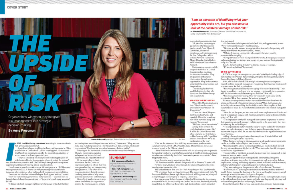
It’s been a while since I last updated my blog but I have been working on some incredible projects. I was extremely enthusiastic to have been contacted by the US based publication, Risk and Insurance Magazine, to photograph the cover for their June 2016 issue. Anne Freedman’s article “The Upside of Risk” talks about the advantages of employing risk managers in organizations with a focus on Joanna Makomaski, president of the Baldwin Global Risk Solutions Inc. Joanna Makomaski is an internationally recognized specialist in enterprise risk management. She recently won the Institute of Risk Management’s prominent Risk Management Professional of the Year award during a 2016 ceremony held in London, England. She also acted as the Vice President of Enterprise Risk Management in the organizing committee for Toronto’s 2015 Pan/Parapan American Games.
Since this was my first US magazine cover, I wanted to particularly demonstrate my skills as a photographer and provide superb quality. I chose to do Joanna’s photoshoot with a Hasselblad H5D – a medium format camera that offers 50 megapixels, incredible sharpness, and colour. And the results were phenomenal. The Hasselblad captured fantastic detail in her hair and clothes. The photoshoot was set in a lavish condo’s party room in downtown Toronto, which had wonderful black and white paisley walls and an enormous window offering tons of natural light.
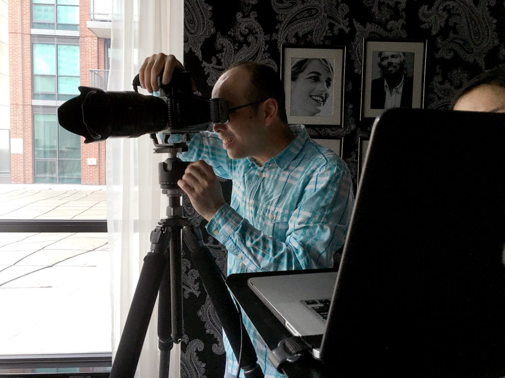
Me with Hasselblad H5D-50
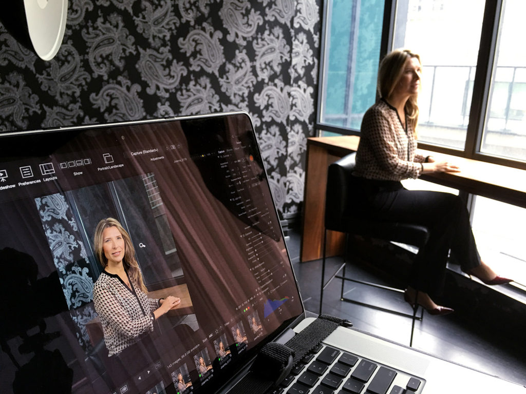
Phocus Software
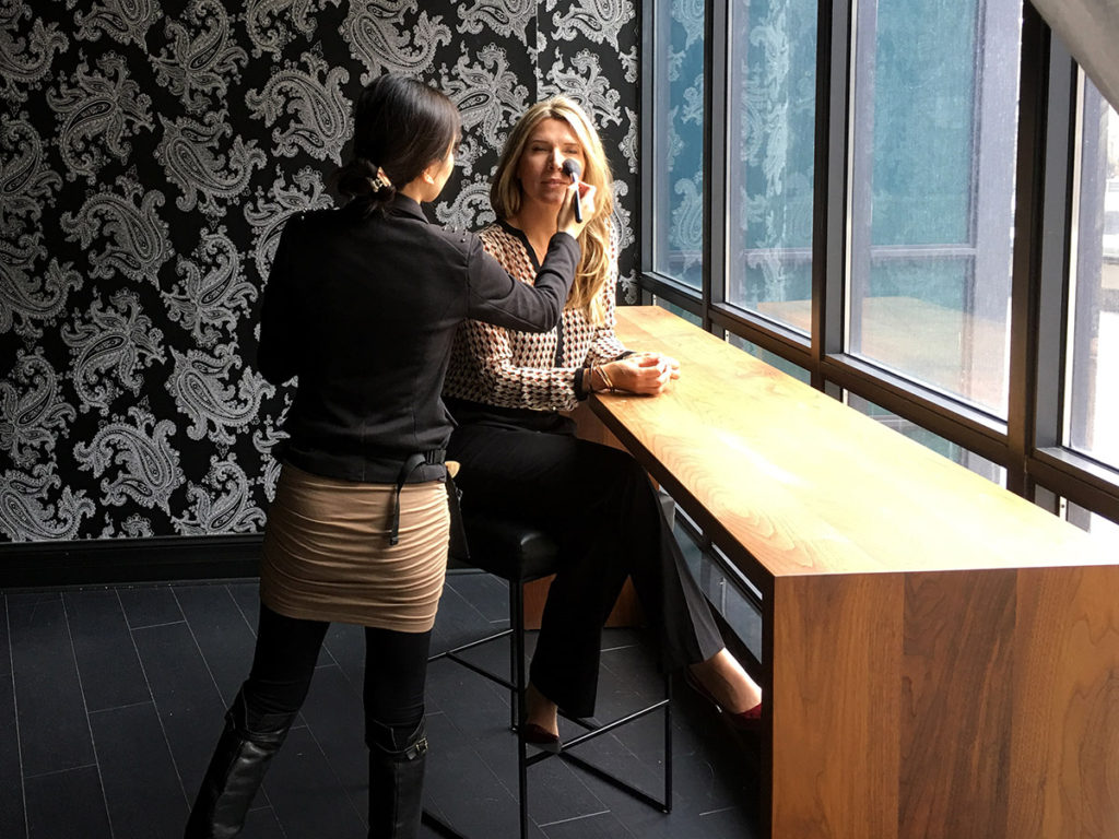
Maggie Ng doing her magic.
Thank you to Sue Casper, who was the editor and art director for this project, to Maggie Ng, who was the make-up artist, and to Joanna.

©2016 Clifton Li Photography
Glen Griffiths for Dockside Magazine
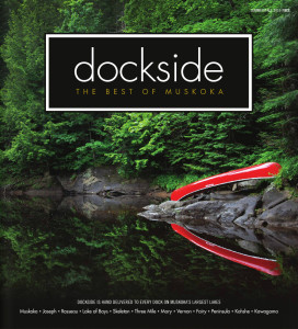
Cover of Dockside Muskoka Summer/Fall 2015 Issue
I was presented with the fantastic opportunity to photograph for Dockside Magazine over the summer. Dockside is a publication that is independently owned and specializes in presenting Muskoka’s best businesses. Featuring interesting articles on cottage life and the outdoors, each issue is hand-delivered to Muskoka’s largest lakes.
The story I shot was about Glen Griffiths, who is the founder of My Outdoor Kitchen. Glen creates incredible outdoor kitchens that are extremely customizable and are convenient to use when entertaining guests. The photoshoot took place on a tremendously hot and sunny day, which made everyone sweat profusely. The glaring sun also made it difficult for Glen to keep his eyes open for a long period of time and I had to set my strobes to full blast to compete with the sun and fill in the shadows.
Fortunately, the shoot went very well and only needed to last for an hour and a half. Be sure to keep an eye out for Glen’s story, which will be featured in the Dockside Muskoka Summer/Fall 2015 issue.

©2015 Clifton Li Photography
National Advertising Awards Collaboration
I am a believer in constantly challenging yourself. In pushing those boundaries, to be that extra bit better than you once were. To learn new things and have new experiences.
I had the opportunity for one such experience when I teamed up with Allen from Y+R and Elizabeth from Leo Burnett to try our hand at the National Advertising Awards. The NAA are all about challenge, the challenge of competition and challenging the status quo. But at the heart of it, they are about innovation and creation.

NAA 2014 Award Entry
To be able to work on this project was an honor and a privilege, and to everyone who took part, thank you so much. We could not have done this without you. In the photographic industry, and in fact, in most industries, you are ruled by deadlines. The NAA are no different. All entrants are given a month to complete their work, but we started the project with just five days until the deadline for submission. It took some team work, and a lot of caffeine, but we made it through.
The shoot went fantastically. We finished in only 6 hours, a time that, Allen commented, was one of the shortest shoots he’s been on. Despite our best efforts, we were not nominated for an award. However, the category we submitted for, “Crystal Light” did not have a winner, so perhaps we were all just too good. In the end, we are proud of what we produced. Not only did we create a beautiful image, but we also formed new friendships.
Lastly, special thanks to Andrew Hiorth for letting us use his studio, and Thomas D. for digital enhancement.
Cover of The Bridal Guide – 2014 Edition
The Bridal Guide has been a valuable source for brides and couples-to-be during their wedding planning process, filled with useful references and inspiration. I was tasked with shooting the cover for their 2014 issue which will be made available at bridal shows and wedding boutiques around the GTA. My team and I got to shoot at a very special location, which was a scenic man-made lake in Caledon, Ontario. Everything pulled together very nicely and made for a very appealing cover.
Special thanks to editor Joe Plati for the wonderful opportunity, it was a great privilege to work with you.

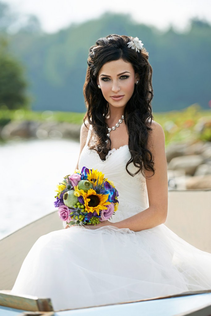
The original photograph. ©2014 Clifton Li Photography.
“Our hats are off…” Ad for Ryerson University in “The Globe and Mail” Newspaper
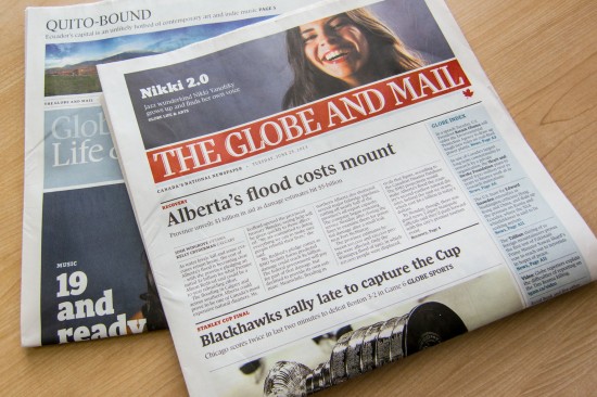
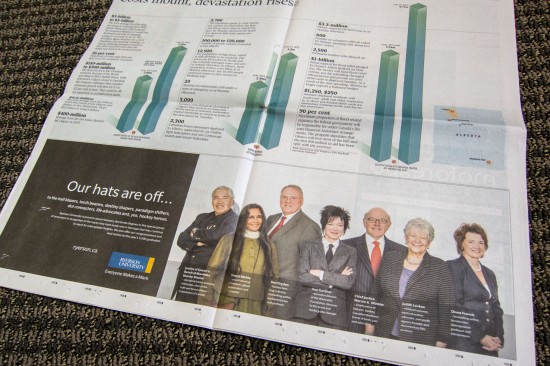
Following up on last year’s advertisement, I was asked to photograph a new ad for Ryerson University published in The Globe and Mail on June 25th, 2013. It featured the seven newest recipients of honourary doctorates conferred by Ryerson University at the 2013 spring convocations. The distinguished honourees for this year belonged to a wide range of disciplines including film, new media, justice, education, politics, etc. It was a delight to meet these extraordinary people and to help commemorate their achievements.
Although, I only had less than 5 minutes to photograph each of the subjects, they each made their own impressions on me. Ken Dryden, the hockey player among other things, was about 6’5″ and had a cast on his wrist at the time so it was an interesting experience trying to accommodate his injury during his shoot. All in all, it was a great opportunity. Hopefully, in another year, I will have the honour of photographing the next group of recipients.

A8 – News in “The Globe and Mail” – June 25, 2013
Ryerson University Magazine – Winter 2013
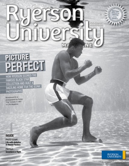
Cover of Ryerson Magazine – Winter 2013
Back in September 2012, I returned to my alma mater, Ryerson University, to take part in Alumni Weekend and to help document the event. The photos are now available in the current Winter 2013 issue of the Ryerson University Magazine.
It was a fantastic day filled with food and fun events, including a skating session on the new ice rink at our new athletic centre in the former Maple Leaf Gardens. I had a blast while contributing back to my university. In addition, I had the opportunity to meet world-renowned photographer Edward Burtynsky, who is a fellow alumni and who also attended the event. Overall, the whole event was very well thought out and, in my opinion, not to be missed.
Ad for Ryerson University in “The Globe and Mail” Newspaper
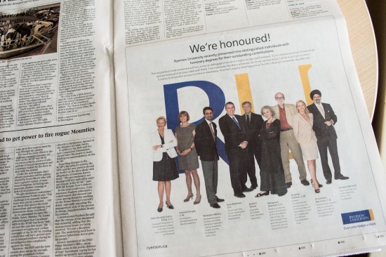
On June 21st, an advertisement was published in The Globe and Mail featured a photo I have taken of nine distinguished individuals including Margaret Atwood and Valerie Pringle. This advertisement was for Ryerson University in celebration of handing out honorary degrees of outstanding contribution to engineers, broadcasters, award-winning authors and film producers alike. As a graduate of Ryerson’s well-known photography program, I, myself, know the excellence of the university and am also gladly associated with these strong individuals as well as been given this opportunity to shoot their portraits.

A5 – News in “The Globe and Mail” – June 21, 2012

