Photoflex 7′ OctoDome Photoshoot Demostration
Anyone who works with a camera will tell you that setting up and capturing an image is a form of communication. A single picture or still frame, when done correctly, has the ability to tell a story. As a result, lighting becomes a crucial aspect of this storytelling. It sets the tone of an image and in advertising, the story or tone told by an image is everything.
The other day, I had the privilege of helping out a friend who owns a games facility used for team building exercises. They were looking for some promotional images that really communicated the energy of the space and showed the wide range of the activities they had to offer in a way that caught the eye and captured the imagination. I needed a light modifier that was able to help me better tell a story and that would contribute to executing the wide range of moods that I wanted to convey.
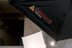
7′ OctoDome
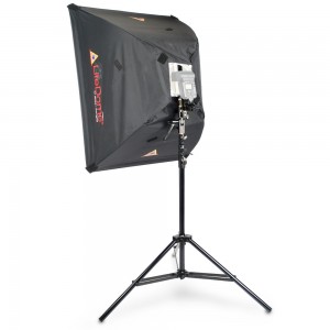
The 7 foot OctoDome from Photoflex was the perfect modifier needed to achieve the different atmospheres and moods I wanted for this shoot. Photoflex is a company dedicated to providing the highest quality lighting equipment. It’s accessories and set-ups are top of the line, and they offer state-of-the-art technologies that help photographers capture that perfect image. With it’s unique, 8-sided shape and narrow profile, the OctoDome is one such technology as it’s designed to be the perfect key light and bathes facial features in bright, soft light. It’s internal baffle eliminates hot spots and it’s designed to give big box light spread in a space-saving soft box. It’s particularly effective when being used with the HalfDome and LightPanel, which were the other pieces of modifying equipment I brought with me for the shoot.

It’s easy for a single person to assemble and easy to set up. It’s dependable and versatile for creating the perfect image under different circumstances and in different environments to relay the exact mood and tone that I’m searching for. The OctoDome excelled at helping me communicate exactly what I wanted to say through the medium of my lens.
The First Setup
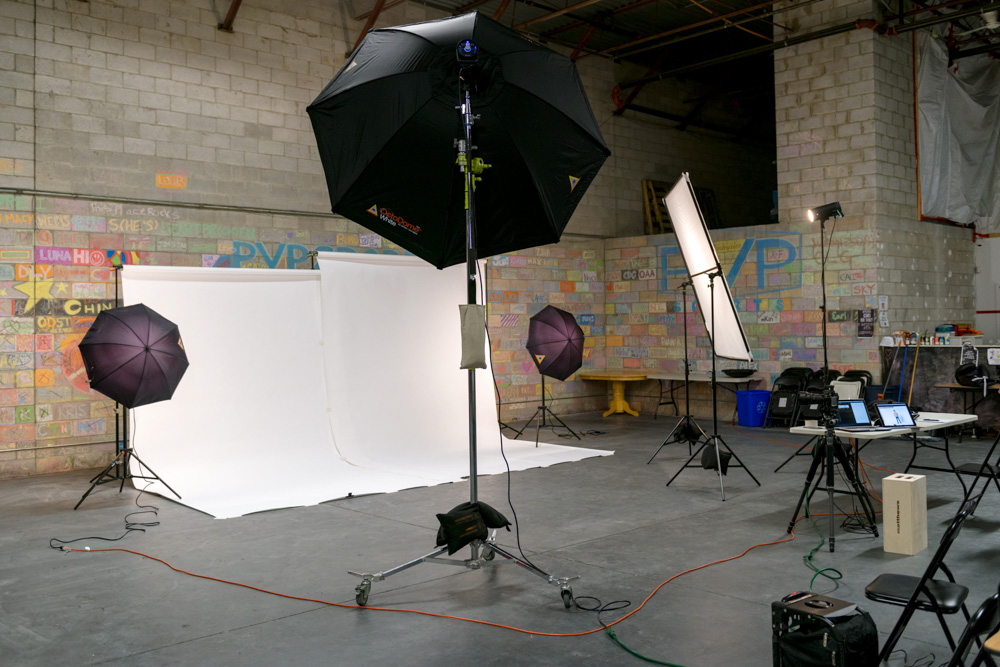
The First Setup
The first of the three set-ups was a white backdrop set up that’s often used for corporate or web-based photos. I used the OctoDome as a frontal key light to create a beautiful, even spread of light that was crucial to a clean bright background. In addition to the OctoDome, I used two Photoflex umbrellas to even out the white tone of the background.
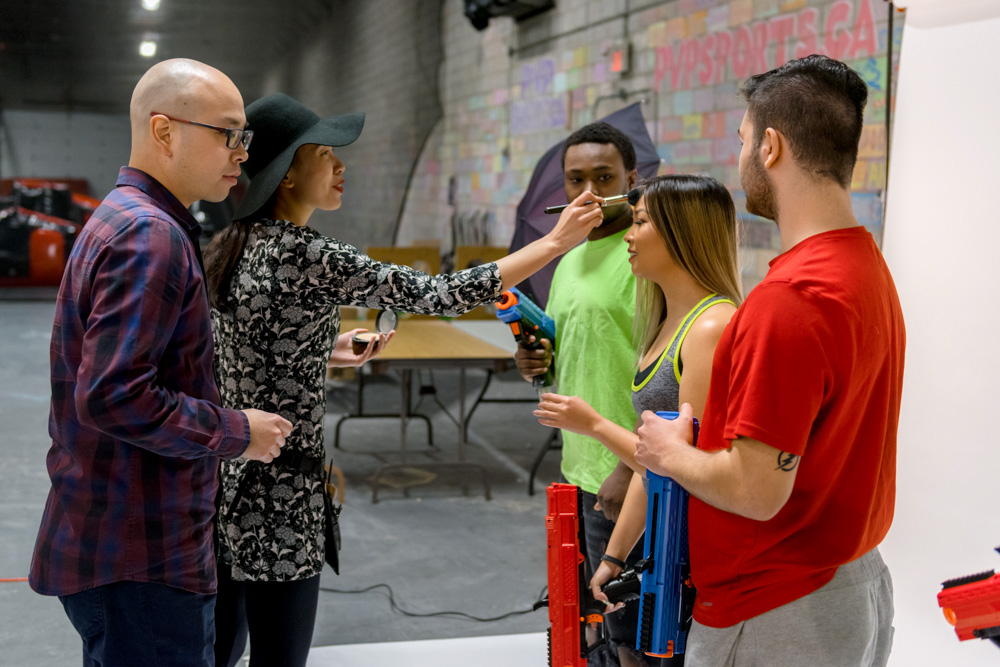
Maggie Ng putting make-up on the models.
To capture the nature of the activities, I put the models in a colourful wardrobe that popped cleanly against the white background and helped show the energy and movement associated with the sports. The LitePanel was used in conjunction with the OctoDome to fill in the shadows and even out the image.
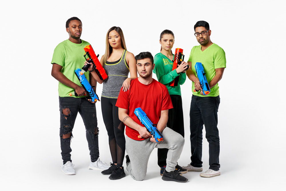
©2017 Clifton Li Photography
The Second Setup
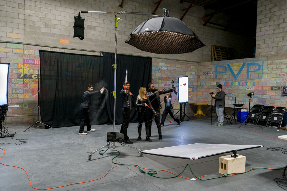
The Second Setup
The second set-up set a much moodier and mysterious tone reminiscent of something out of a gritty action film. We changed the OctoDome from a frontal key light to a top light with the addition of a grid to create a harsher shadow. The black background, in combination with the addition of coloured gel added to the medium half-dome at the sides of the back light and the added haze, contributed to the more ‘dangerous’ vibe that would peak the viewers’ interest. I had originally attempted to add a grid to the half dome as well, however I found that the haze didn’t catch enough light due to a limited spread.
But it didn’t work as expected due to lack of light spread, the haze didn’t catch enough light, so I took them off. Sometimes it pays to step back and keep in mind the KISS method – Keep It Simple Stupid! The simpler set-up in this instance proved to be what we needed to give off that post-apocalyptical vibe I was searching for.
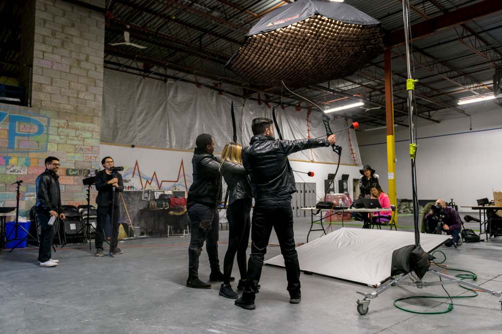
Another Perspective of the Second Setup
Models dressed in edgy black leather and with serious emotional expressions (I had told them to think of the hit book/movie series “The Hunger Games” while composing their facial expressions for this shot) completed the look, reflecting the blue edge light and popping their faces in the final image for a crisper look.
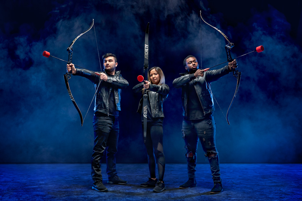
©2017 Clifton Li Photography
The Final Setup
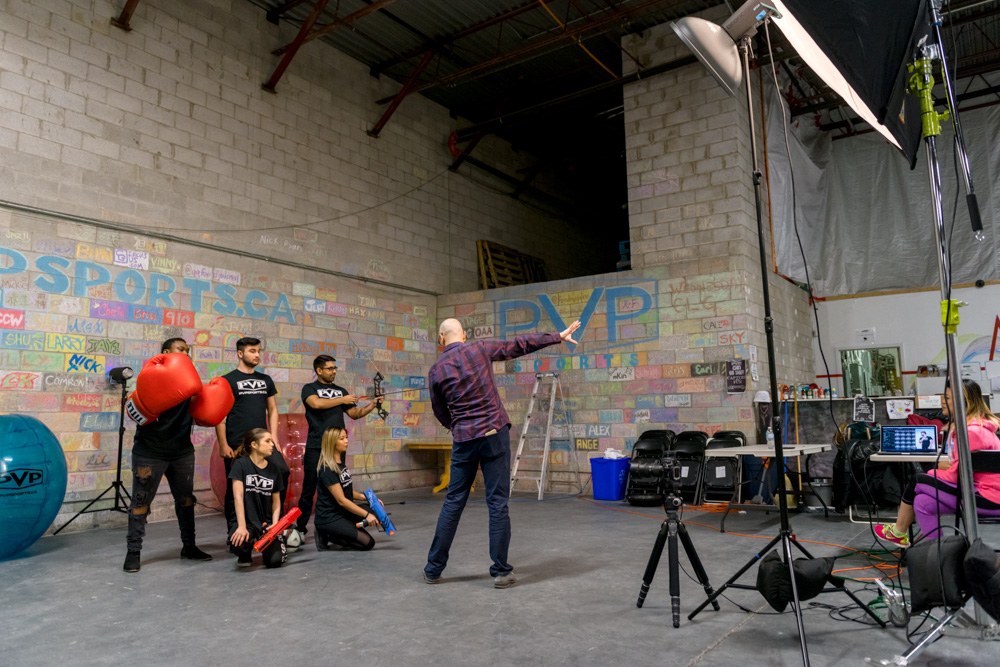
The Third Setup
The final set-up, thanks to the good background and location, was the simplest to achieve. The beauty dish helped better define the background bricks and really accentuated the features of the
models, and the OctoDome helped fill in the shadows and lessen the contrast. Using a bare bulb backlight cut out the models from the background, adding depth to the image and making each model stand out.
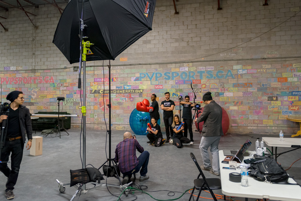
Another Perspective of the Final Setup
The back light is the brightest part of the photo, and combined with the added shadow on the floor creating a natural vignette, the viewer’s eye is very effectively drawn to the middle of the shot, where the PVP logo is front-and center, surrounded by all the available activities at the facility – crucial to any high quality promo image. It was a fun, clean, even wholesome look that conveyed “fun” and “teamwork”.
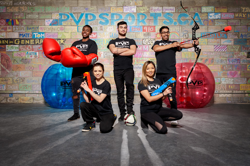
©2017 Clifton Li Photography
In the end, both the client and I were thrilled with the images, none of which would have been fully realized without the help of the OctoDome, or any of the other Photoflex products that I used. The high standards they set for their products was totally evident, and their ease of use and the stunning final images have cemented their permanent place in my arsenal. I highly recommend that any photographer serious about their craft head over to their website and check out what they have to offer.
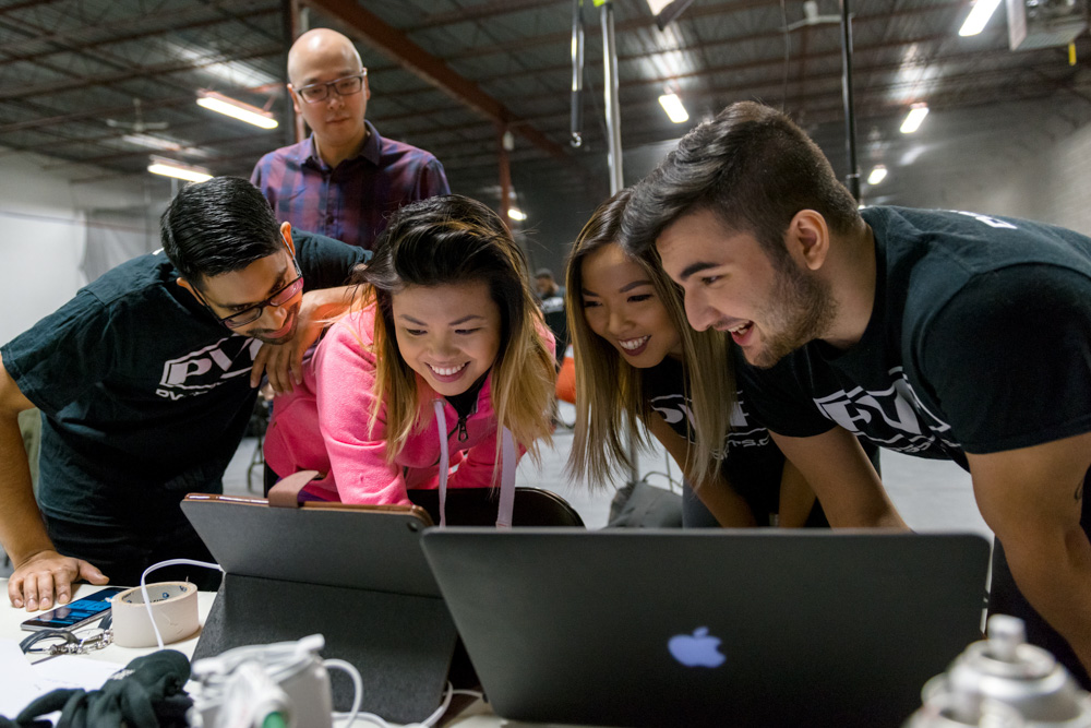
Clients and models reviewing the images.
I know that my upcoming projects, like this one will be all the more spectacular with Photoflex at my back.
Credits
Make-Up Artist: Maggie Ng
Assistant: Brian So
CIL Paint Ad – Penny Project with DDB Canada
Recently, I have been working on some incredible projects. I got this amazing opportunity to work with David Ross and Dean Hamann from DDB Canada to cooperate on an advertisement project for CIL Paint.
The print ad is meant to be a continuation of the TV commercial that was a huge success last year.
The ad concept was to photographically and digitally construct a penny where the Queen was putting on lipstick to show the affordability yet great quality of CIL paints – “Beauty on a small budget”.
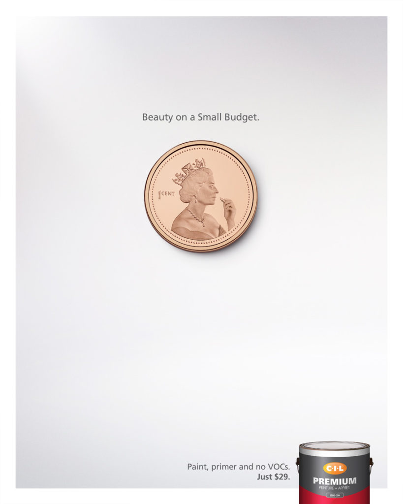
Final Ad Layout
I was so enthusiastic about the idea when it was presented to me that I started organizing the photoshoot the same night. Since Canadian pennies are no longer being circulated, it wasn’t easy to find a penny, especially not one that was perfect without any scratches. So I simply bought a collector’s penny that was in mint condition for ten dollars. It was definitely worth it, particularly if it meant that it would save editing time in post-production.
But searching for the coin was not the difficult part, it was imagining the Queen’s attire when she took the photo for the penny. I re-imagined the Queen with some added humor by hiring a curvier model to emphasize the sexiness of the act of applying lipstick.
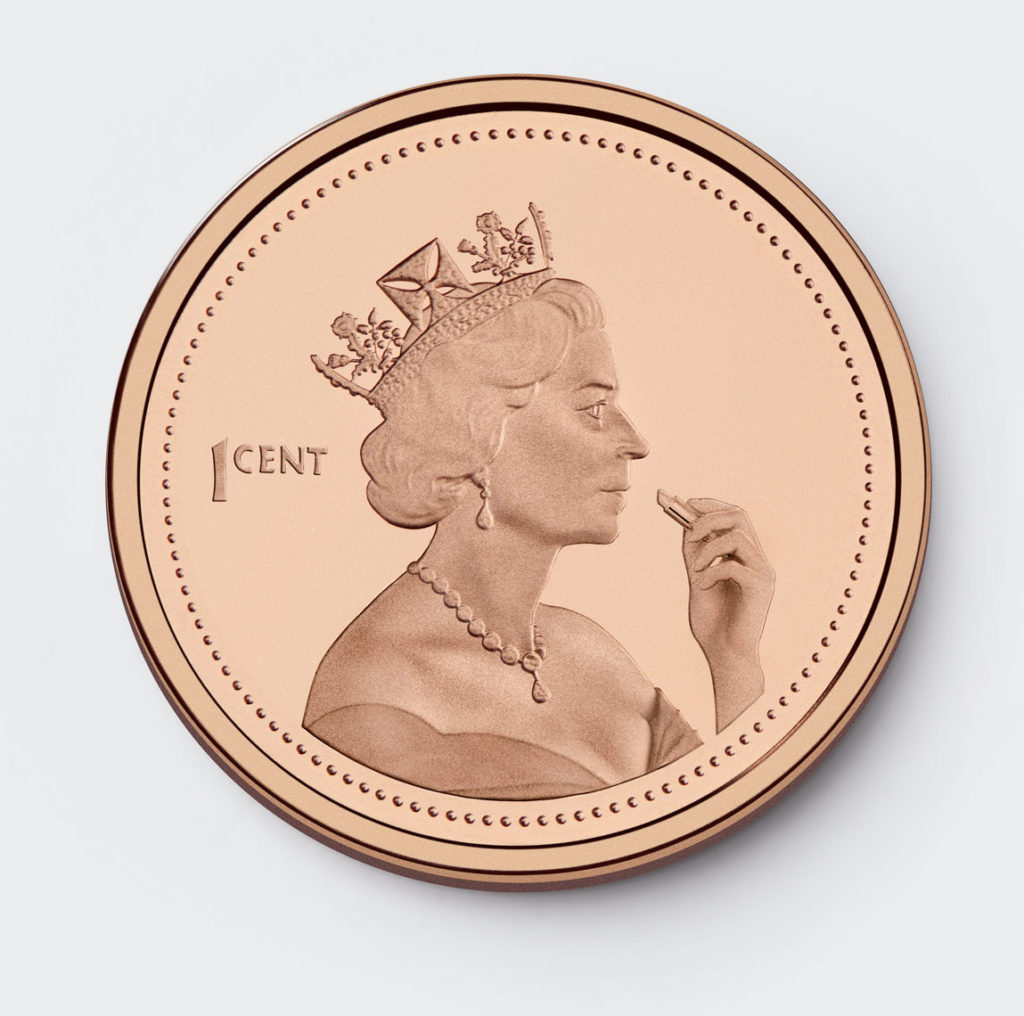
©2016 Clifton Li
For the photoshoot, I used a large Photoflex strobe softbox to give me consistent lighting and to match the lighting of the penny. Photoflex creates softboxes that have quick-release corners making them easy to set-up and tear-down. Their softboxes are made with a DuraCloth fabric that ensures colour neutrality, softened light, and prevents light leaks. The Queen’s image on the penny was softly and evenly lit, which will also make the retouching job a lot easier. The shadows were painstakingly matched to make the ‘Queen’ appear as realistic as possible.
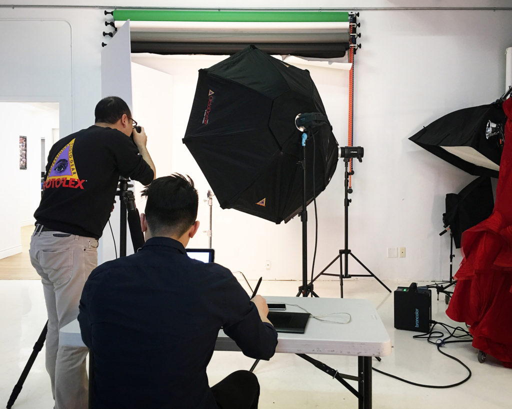
The setup at the studio
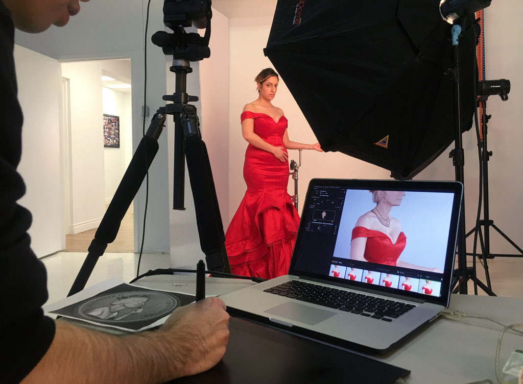
Dress and the model
Thank you to David for providing with me this wonderful and fun opportunity and to Photoflex for sponsoring the photoshoot.
Creative Project with Palettera and Ferris Wheel Press
In this blog post, I will be sharing with you my photographic process, from the drawing board to the finished product.
Deborah and Ray, the creative minds behind Palettera Custom Correspondences and good friends of mine, wanted to cooperate on a project that put all of our best talents forward. Palettera has become one of the best custom stationery design companies in the wedding industry and with good reasons. They are a Canadian company that promotes hand-craftsmanship, quality, and originality. They produce beautiful and unique wedding stationery designs in order to make each wedding feel one-of-a-kind. In light of their success, Deborah and Ray started a sister company called Ferris Wheel Press in recent years, which is operated by Ray’s brother, Jimmy.
Concept and Brainstorming
First and foremost, I started with planning out a concept. Since I was so fascinated by the immense quality of the designs, I decided I wanted to depict the illustrations coming to life. I began with meticulously going through their online portfolios to see if there were any pre-existing designs that would be most suitable for this concept. I came upon a card from the Goldfish series and felt it was the perfect candidate for this concept. I then drew a rough draft of my idea and afterwards I started scouting for my future team members.
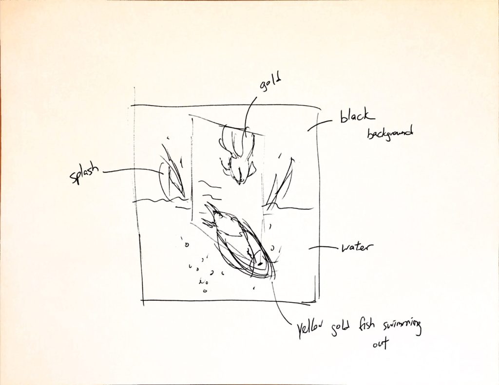
The sketch used to present my Idea to the team.
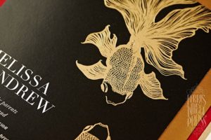
The design that inspired my idea.
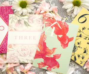
The position of the fish that I want to recreate in black and gold.
Building the Team
Building the team is one of the most important steps because these are the people that will be helping to make the concept become a reality. I worked with the people from Palettera and Ferris Wheel Press in order to obtain the cards that I needed to shoot. They were very nice and created for me a black card with gold illustration to precisely match my concept. From the Plutino Group, I invited Jeanie Lee to be the prop stylist for the project. Jeanie was in charge of sourcing the live goldfish for the photoshoot and for creating the water splashes that would be included in the final shot.
Last but not least, Photoflex provided the light modifiers that helped to give the photoshoot that magic touch and helped to bring everything to life, particularly the goldfish.
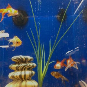
Goldfish options from Jeanie.
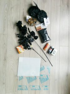
Prop ideas.
Shooting the Card
Prior to photographing the goldfish and the water splashes, the card had to be shot. This was done in advance so that I could have time to edit the image in Photoshop. I removed the text that was originally on the card and the placement of the fish had to be altered slightly. The position of the goldfish had to be exact so that the editing of the real goldfish could be seamlessly done so afterwards. I modified the placement of the fish by combining a few images together, however, I had to ensure that the reflection of the light hitting the gold letterpress was consistent throughout the images – this was difficult.
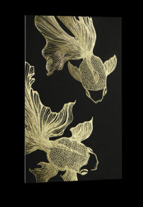
Custom created card.
Shooting the Fish and Splashes
Once we had the image of the card, then we knew exactly how we needed to position the real goldfish in the photoshoot. This step was the most challenging since they are real fish, they are unpredictable, uncontrollable, and most of all, harm-able – and we didn’t want to harm them. We gently played with them for two hours and after an entire two hours, we only had one usable frame! It’s important to say that no goldfish were mistreated during the photoshoot or play.
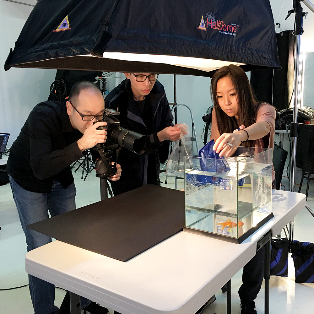
We were working hard to push the goldfish to move the way we want.
The next piece of the puzzle was to get a good image of the water splashing, the bubbles, and the waves. We kept playing with the water until we captured the perfect shot. We used the Broncolor Scoro in combination with the Photoflex Softbox in order to freeze the movements of the goldfish and the water. This combination gave a brilliant and even light to the scene. While the strobes were quite far away, the Scoro had a 3200-watt power, which gave me just enough light for the depth of field I needed.
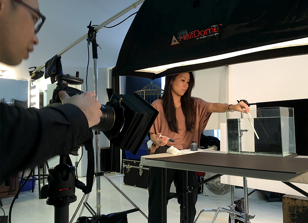
About to create bubbles.
Post-Processing
Finally, the post-production work! It was really fun to pick from a variety of splash and bubble images to see which one would work best with the composite image. I photographed all the images against a black background since I knew the final image would have a black background as well. This strategy also helped to save a significant amount of time cropping the bubbles out from the background.
I am incredibly satisfied with the end result and so impressed with everyone’s hard work and contribution. Thanks to Jeanie’s expert skill in handling the fish and creating the water splashes. The photoshoot was much shorter than we all predicted. This project was a great addition to my portfolio since I had no animal-related shoots prior to this and it demonstrated my ability to create the perfect composite image.
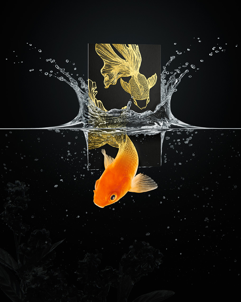
The final composition!
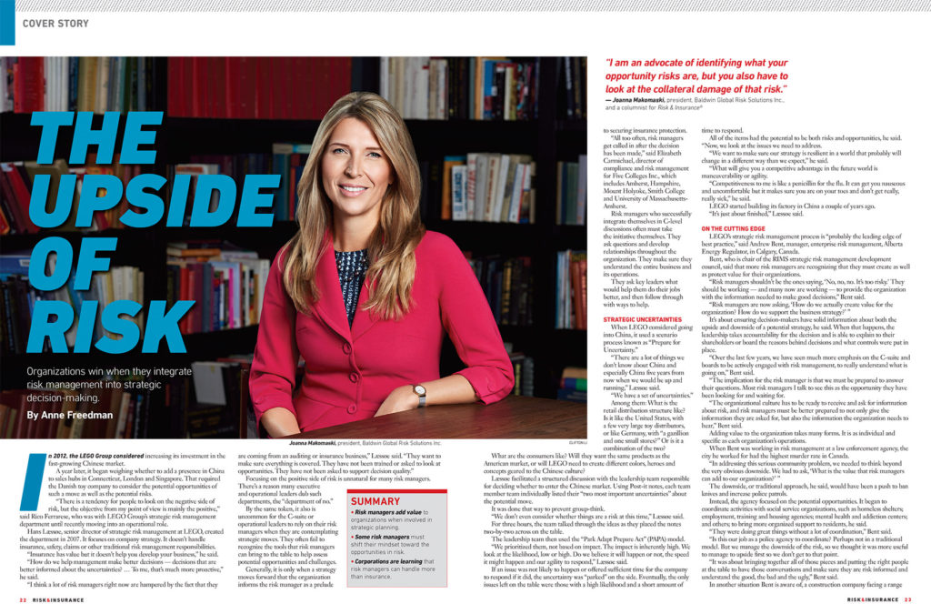
Joanna Makomaski for Risk and Insurance Magazine

Cover of Risk & Insurance Magazine – June 2016 Issue
It’s been a while since I last updated my blog but I have been working on some incredible projects. I was extremely enthusiastic to have been contacted by the US based publication, Risk and Insurance Magazine, to photograph the cover for their June 2016 issue. Anne Freedman’s article “The Upside of Risk” talks about the advantages of employing risk managers in organizations with a focus on Joanna Makomaski, president of the Baldwin Global Risk Solutions Inc. Joanna Makomaski is an internationally recognized specialist in enterprise risk management. She recently won the Institute of Risk Management’s prominent Risk Management Professional of the Year award during a 2016 ceremony held in London, England. She also acted as the Vice President of Enterprise Risk Management in the organizing committee for Toronto’s 2015 Pan/Parapan American Games.
Since this was my first US magazine cover, I wanted to particularly demonstrate my skills as a photographer and provide superb quality. I chose to do Joanna’s photoshoot with a Hasselblad H5D – a medium format camera that offers 50 megapixels, incredible sharpness, and colour. And the results were phenomenal. The Hasselblad captured fantastic detail in her hair and clothes. The photoshoot was set in a lavish condo’s party room in downtown Toronto, which had wonderful black and white paisley walls and an enormous window offering tons of natural light.
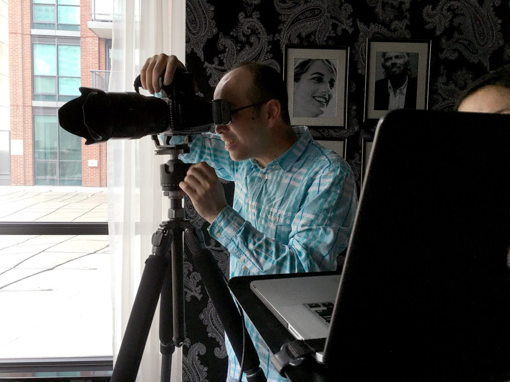
Me with Hasselblad H5D-50
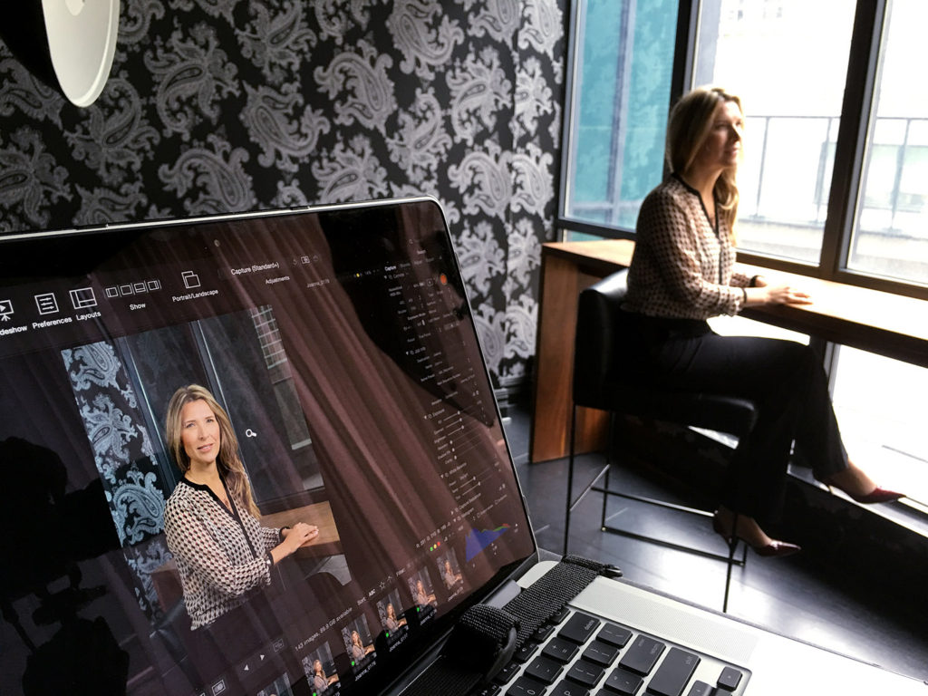
Phocus Software
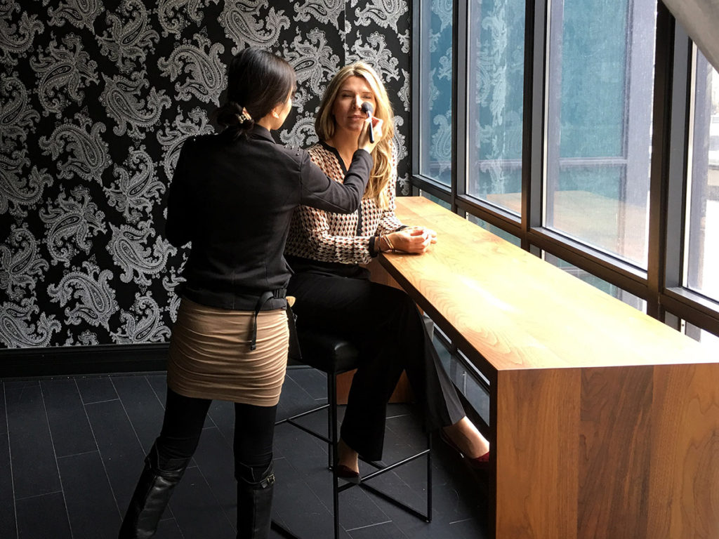
Maggie Ng doing her magic.
Thank you to Sue Casper, who was the editor and art director for this project, to Maggie Ng, who was the make-up artist, and to Joanna.

©2016 Clifton Li Photography
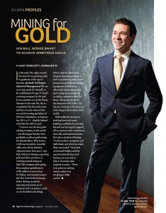
Ian Ball for Ryerson Magazine
They say opportunities present themselves when you least expect it. But what I believe is that through ambition and hard work you can take charge of creating your own opportunities.
Cover of Ryerson Magazine Summer 2014
I was given the fantastic opportunity to photograph Ian Ball, who was the preseident of McEwen Mining at the time of the photoshoot, for Ryerson Magazine. Ball admits he was never the perfect student in high school but decided that that needed to change during his time at Ryerson University. I was only given 30 minutes of face time with the “golden boy of mining” and I was anxious to say the least. The shortness of time was a first for me but I was prepared and already had a vision in mind.
I wanted to create an image that reflected Ian as an individual and that would also illustrate his new position within the metal industry. I decided on an aesthetic that was slightly darker, that had a medium contrast, and was dramatic, and that it would be reminiscent of not just the metal industry but also mines themselves.
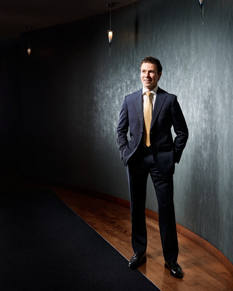
©2014 Clifton Li Photography
I used a beauty dish as my main light, giving my subject a beautiful, even glow, while the Photoflex medium strip box was used as a backlight, offering a nice edge light. Keeping the grid on the Photoflex prevented light from spilling onto the background, maintaining the moody atmosphere. Although the time allotted only allowed for one lighting setup, the shoot was surprisingly completed with 5 minutes to spare!
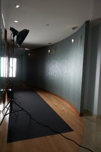
Behind the Scene
The photoshoot was a great success and Ian was more than pleased. Each person on the team received a McEwen silver coin as a memento to keep (or to auction off to the highest bidder). I especially thank Wendy and Colleen for the wonderful opportunity and art direction.
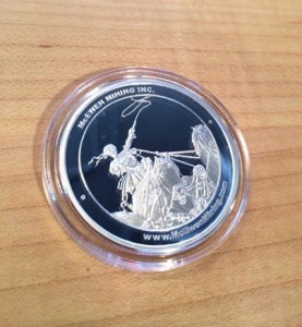
McEWEN Silver Coin
BTS: York Region Transit Fall 2013 Photoshoot
In this post I will discuss a shoot I just completed with the assistance of Photoflex lighting equipment. This will be my first update in my role as one of Photoflex’s Canadian Ambassadors.
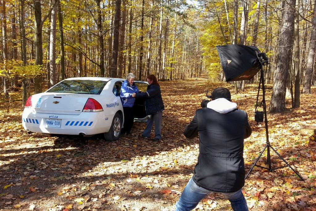
© 2013 Clifton Li Photography. All Rights Reserved.
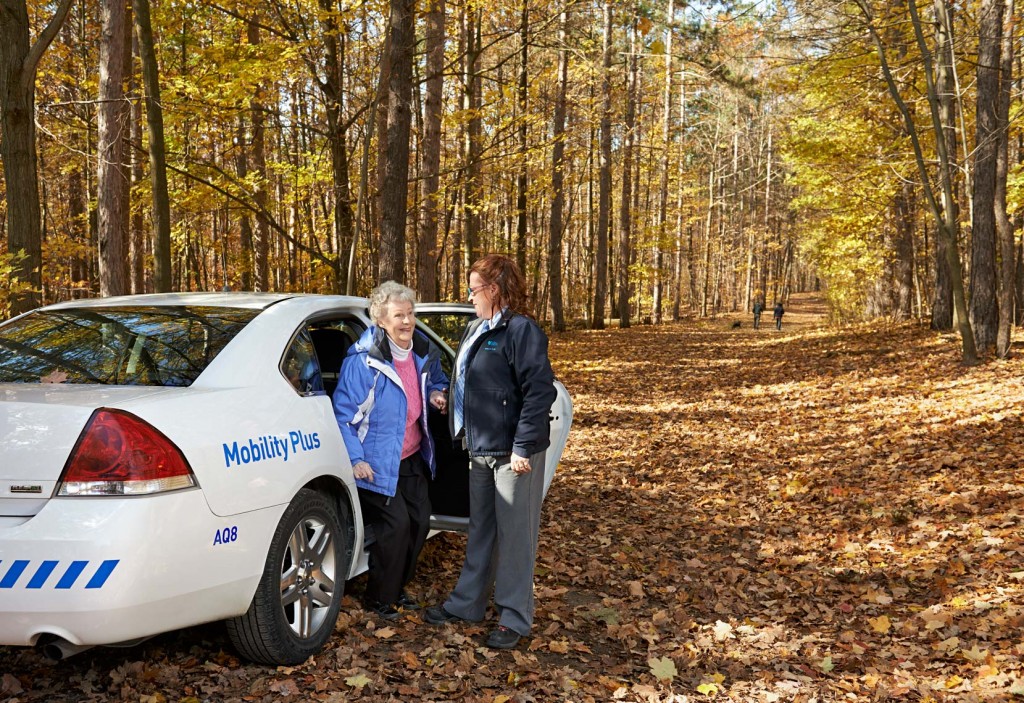
© 2013 Clifton Li. All Rights Reserved.
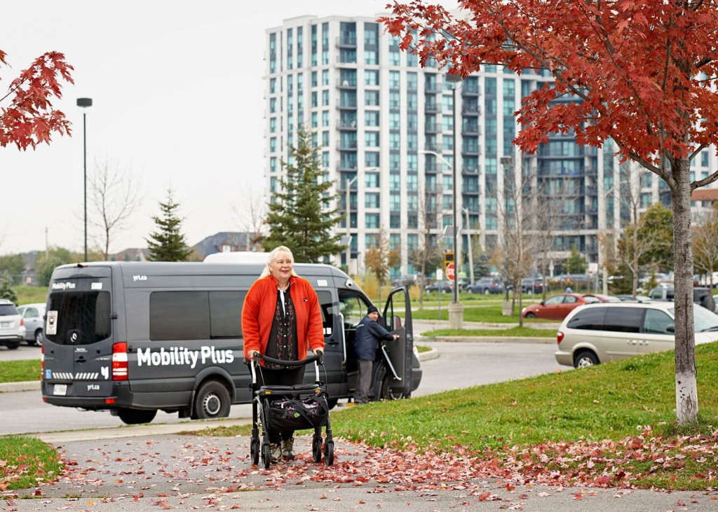
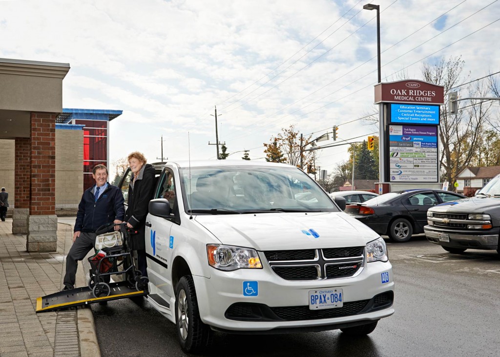
I recently received a job from York Region Transit (YRT), the company responsible for providing public transit to the suburbs north of Toronto and a company that I am very familiar with. I am a fan of their blue coloured buses and smart branding. The YRT employees were very friendly and accommodating during the shoot. This shoot was part of their fall campaign to bring awareness about the YRT’s Mobility Plus program, which assists persons with disabilities to get around the York Region safely and easily. This program extends across a variety of different vehicles that the YRT employs on a daily basis. The photos will end up either on their website or their 2014 Calendar.
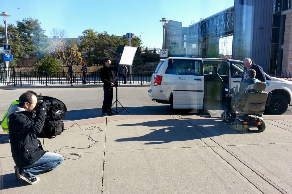
© 2013 Clifton Li Photography. All Rights Reserved.
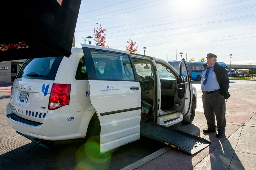
© 2013 Clifton Li Photography. All Rights Reserved.
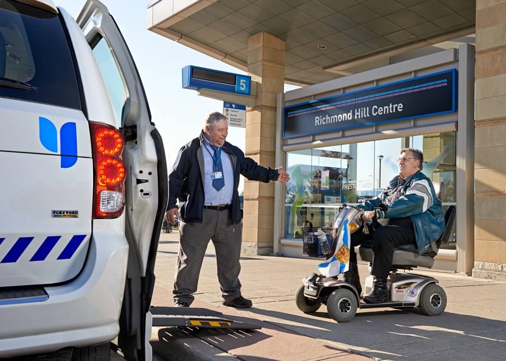
© 2013 Clifton Li. All Rights Reserved.
I was very eager to have the opportunity to do this shoot which lasted two days and spanned 8 different locations. Luckily, despite that it was late October, the weather was very warm and dry and the leaves were in full colour, perfect for a fall shoot.
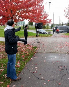
© 2013 Clifton Li Photography. All Rights Reserved.
© 2013 Clifton Li. All Rights Reserved.
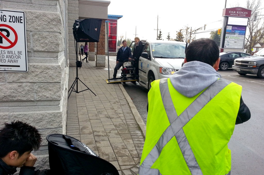
Because this shoot utilized 8 different locations, I needed equipment that was very mobile. Photoflex graciously supplied their Medium LiteDome Deluxe kit, which was well-matched for my purposes. This product is very affordable and is of a good built quality. It was very effective in spreading the light from the flash enough for the entire scene I was shooting, in addition to being versatile and easy to mobilize.
For this particular shoot, since it was bright and sunny outside, I used the flash as a fill light. I placed the light close to the faces of the subjects to make sure they were not hidden in the shadows. The reason why I choose the medium softbox is to spread the light as much as possible. At maximum power, the flash did a good job of balancing out the light natural sunlight.
The final shots are right underneath the BTS photos. I was using a Nikon D800E with either the 24-70mm or 70-200mm lens. I personally like megapixel, so more the better.
Of course, with every shoot, a photographer runs into different limitations. The biggest difficulty I encountered on this shoot was getting enough battery power to run the laptop. I solved that problem by renting a generator to keep my laptop charged.
© 2013 Clifton Li. All Rights Reserved.
© 2013 Clifton Li. All Rights Reserved.
Overall I am very happy with the lighting effect that the setup provided and I am very satisfied with the results of the shoot. A huge thanks is due to the YRT for inviting me to participate in their fall campaign and for being so hospitable during the entire process.
And I would like to thank Photoflex once again for their continued support.
Special Thanks to Make-up Artist – Maggie Ng for BTS photos.
Lighting a Car in Studio with Giant Softbox
I recently came across this behind-the-scenes video by Todd Mclellan which I thought was enlightening. It demonstrates a very simple setup for a car shoot which requires only a huge softbox at the top. Really great lighting combined with Photoshop post-processing are two essentials which go a long way in any automotive shoot.
How to Light a Lamborghini with Blair Bunting
I found this behind the scene video at Blair Bunting‘s blog very interesting. He basically taught us about the equipments and techniques neccessary to light a car in a studio setting.
Final Image:

You can read the Blair’s entire post here: http://www.blairbunting.com/blog/?p=2509
Zenith + Nadir Magazine – Editorial Photoshoot

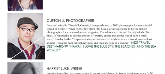
I was extremely excited when I was asked by the Ryerson Fashion Faculty to be the editorial photographer in the Mass Exodus 2011: Zenith+Nadir Magazine. It was a 2-days shoot that took place at The Berkeley Church. Special thanks to Headshots Rentals for sponsoring us with all the Profoto gears I needed.
To be honest, this shoot was very intense and my index finger never stopped clicking the shutter. I basically needed my assistants to start setting-up the next location while I was still shooting at the previous spot. To conclude, it was definitely a great and awesome experience to work with an elite team from Ryerson University.
My Bio in the printed in the Magazine:
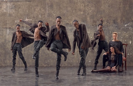
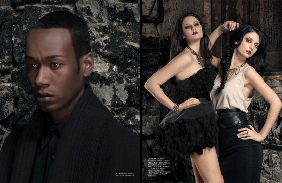
The Editorial Spreads published in Zenith + Nadir Magazine photographed by me:

Behind the Scene of the Editorial Shoot:
(music by J Dilla, video produced by Galen Milne-Hines)
Designer Hats Spring/Summer 2011 – Behind the Scene
It was a pleasure to be invited as a photographer to take part in a Toronto-based designer hats fashion company for their spring and summer 2011 catalog editorial shoot.
The 2 intense days of shooting were very enjoyable. Location scout was essential in order to plan ahead of time and breeze through the shoot with such a tight timeframe. The weather was very cooperating and food was very delicious! Obviously I am BSing if I say everything went perfect and smooth. One of the Profoto D4 packs failed during the first hour of the shoot, and sadly all the rental places were out of them (probably due to the nice weather). With only one D4 pack left, it was not enough to light 2 different sets simultaneous, so we changed the entire concept and went with natural light.
Here is the behind the scene video:
Model Agencies:
Next Models
Elmer Olsen
Personal Assistant:
Benjamin Killick

